Google Maps works. Until it doesn't.
A semester-long, four-method usability study that went beyond getting directions — exposing where one of the world's most-used apps quietly fails the people who rely on it most.
One billion users. Not one of them reads the manual.
01 — ContextGoogle Maps has over a billion monthly users. For most people, the core experience is frictionless — search a destination, start navigation, done. But that ease masks a different reality: the moment you venture beyond those two taps, the app becomes a different product entirely. One with buried menus, confusing terminology, and features that experienced users swear should exist but can't find.
This was a semester-long usability study run with four teammates. We weren't trying to redesign Google Maps. We were trying to evaluate it rigorously — to find where the experience breaks down, why, and for whom. What made the project compelling was the methodological discipline: we ran four completely different research methods and tracked which issues surfaced regardless of how we looked for them.
The team
Four methods. Each sees what the others can't.
02 — Research methodsWe designed the study to triangulate — not just to find problems, but to build confidence that the problems we found were real. If an issue appeared in the heuristic evaluation, the survey, the unmoderated test, and the moderated session, it wasn't an artifact of any one method. It was a genuine usability failure.
Heuristic Evaluation
All five researchers independently walked through Google Maps using Nielsen's 10 heuristics against defined task scenarios. Surfaced a fast, structured baseline before involving real users.
Survey
Quantitative data on perceived usability and feature awareness. Revealed a significant gap between what users thought they could do in the app and what they actually could.
Remote Unmoderated
15 participants completed 5 real-world tasks via UserTesting.com. Closest to how people use the app in the wild — no moderator, no intervention, behavioral data at scale.
Remote Moderated
5 participants completed 16 tasks each in a think-aloud moderated session. The deepest probe in the study — revealing the "why" behind user behavior that no other method could surface.
What Unmoderated Gave Us
- Behavioral data at scale without moderator influence
- Real usage patterns across a wider range of people
- Task 5 (Save/Share) consistently high ease across all 15
- Task 3 (Offline Maps) and Task 1 (Add Stop) were the consistent failure points
What Moderated Added
- Think-aloud revealed mental models behind every hesitation
- Could probe edge cases and configuration flows
- Confirmed that experienced users hit the same walls as novices
- Live observation of backtracking and dead-end searches
14 tasks. 25 minutes. Vishal.
03 — My moderated sessionI facilitated one full 14-task moderated session. My participant, Vishal, was a regular, confident Google Maps user — exactly the type of person who shouldn't struggle. Watching him navigate revealed something every usability researcher knows intellectually but needs to see in person: familiarity with a product doesn't protect you from its information architecture.
"I use Google Maps every day. I just didn't know this feature existed — or if
it did, I couldn't find it."
Composite of moderated session participants across all 5 sessions
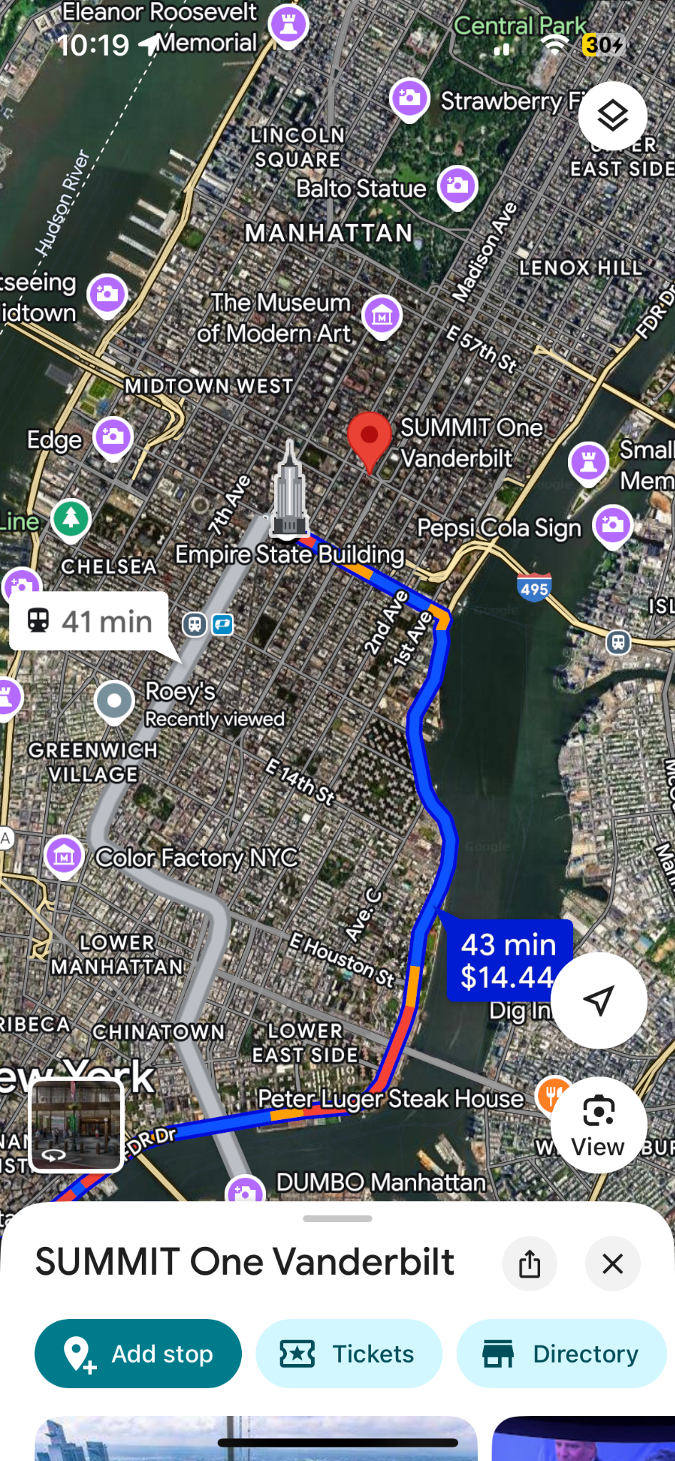
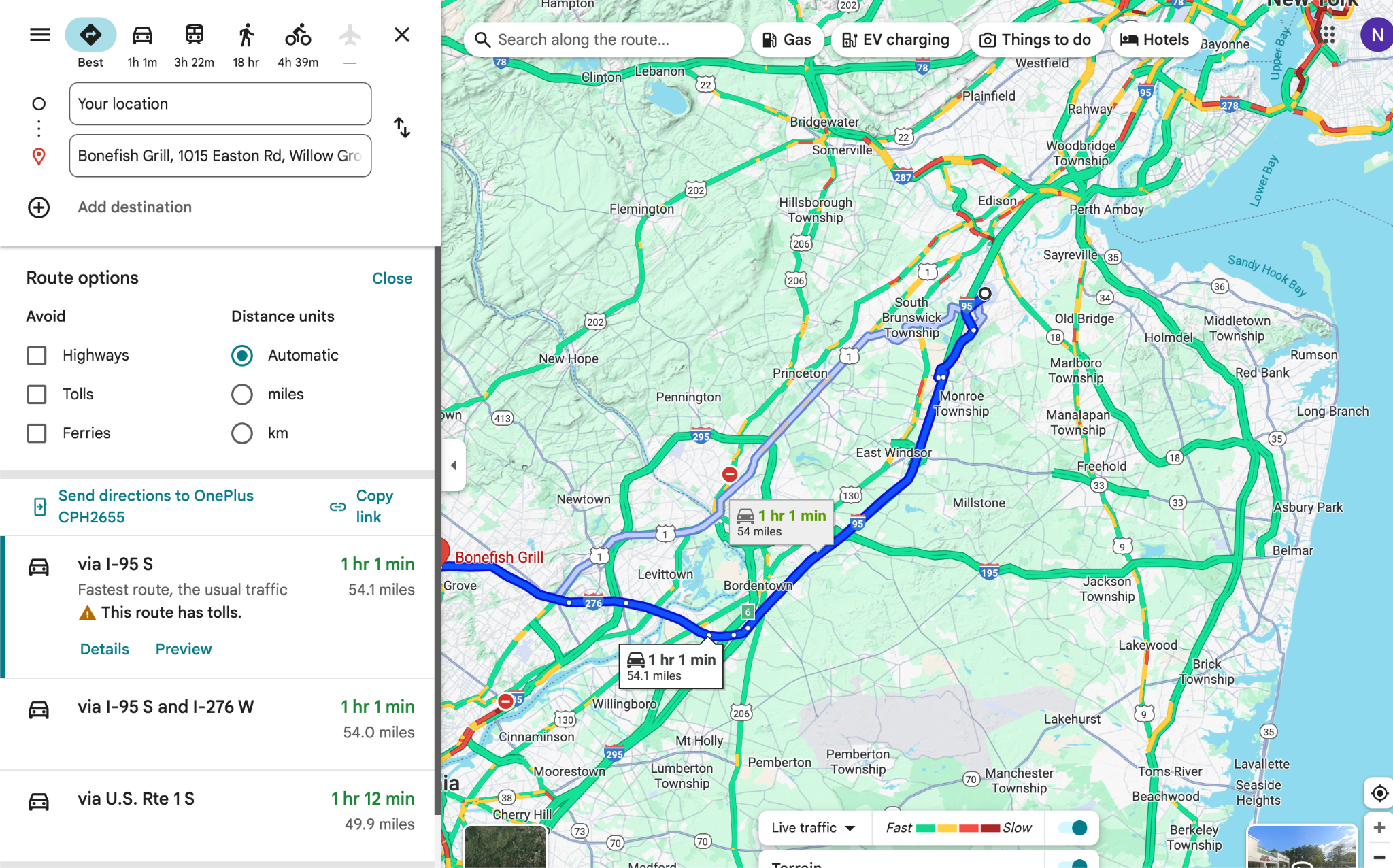
Vishal completed 11 of 14 tasks successfully. The three failures — Plan an Arrival Time, Multi-Modal Route (Car + Train), and Set Up Home/Work Address — shared a common thread: they all required navigating two or more menu layers to reach a feature the app doesn't surface proactively.
| # | Task | Outcome | Ease (1–5) |
|---|---|---|---|
| 01 | Add a stop during active navigation to Target | ✓ Success | 4/5 |
| 02 | Plan an arrival time for a trip to MOMA by 5:00 PM | ✗ Failed | 1/5 |
| 03 | Download offline maps + search within area (Pocono Mountains) | ✓ Success | 5/5 |
| 04 | Multi-modal route: drive to Newark, train to NYC, arrive Empire State Bldg by 2 PM | ✗ Failed | 2/5 |
| 05 | Save and share a favorite location (Peet's Coffee) | ✓ Success | 5/5 |
| 06 | Search with filters + check busy hours (brunch, Hoboken NJ) | ✓ Success | 5/5 |
| 07 | Check elevation of Big Pocono State Park via map views | ✓ Success | 5/5 |
| 08 | Find nearest forest using map layers | ✓ Success | 5/5 |
| 09 | Set up home or work address in the app | ✗ Failed | 3/5 |
| 10 | Public transit route + departure times (San Francisco) | ✓ Success | 5/5 |
| 11 | Find a past visit using Timeline / Location History | ✓ Success | 4/5 |
| 12 | Explore Jersey City via Street View (Grove St PATH Station) | ✓ Success | 5/5 |
| 13 | Share real-time ETA with a friend during active navigation | ✓ Success | 5/5 |
| 14 | Search for hardware stores + check closing time | ✓ Success | 5/5 |
The pattern in the failures: Tasks 2, 4, and 9 all required accessing features that exist but aren't surfaced on the main navigation screen. Vishal knew the features should exist. He just couldn't find the path to them.
What we found across every method
04 — Key findingsIndividual findings are interesting. Cross-method findings are defensible. The issues below surfaced consistently whether we were running a structured heuristic review, collecting survey responses, watching 15 unmoderated recordings, or sitting across from a participant in a think-aloud session.
Core navigation works. Everything else is a maze.
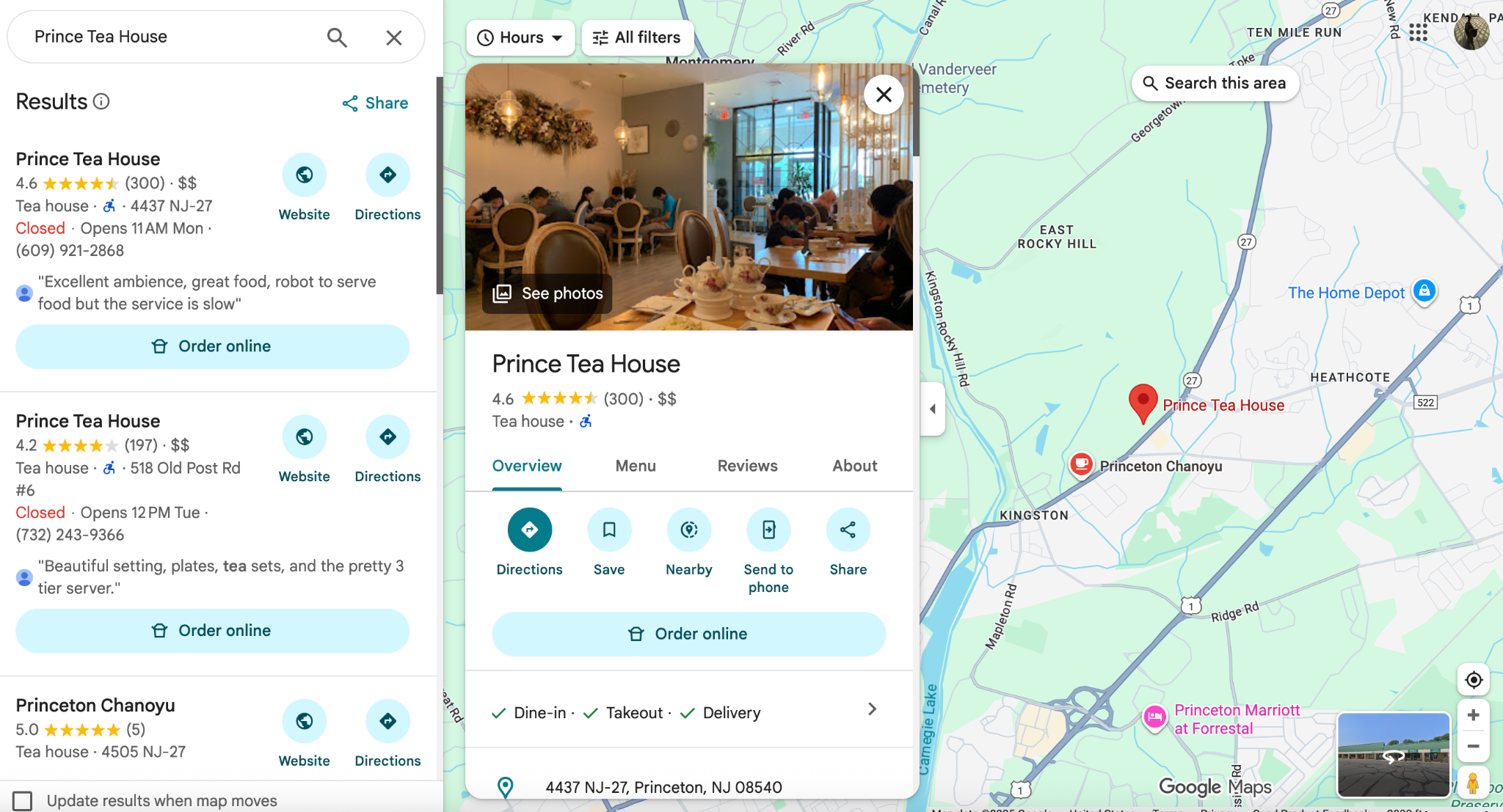
In both unmoderated and moderated studies, participants handled basics — search a place, get directions — without friction. But the moment a task required more than two taps, success rates dropped sharply. Adding a stop, setting offline maps, enabling multi-modal routing: consistently failed even for daily users.
The information architecture breaks down in the layers.
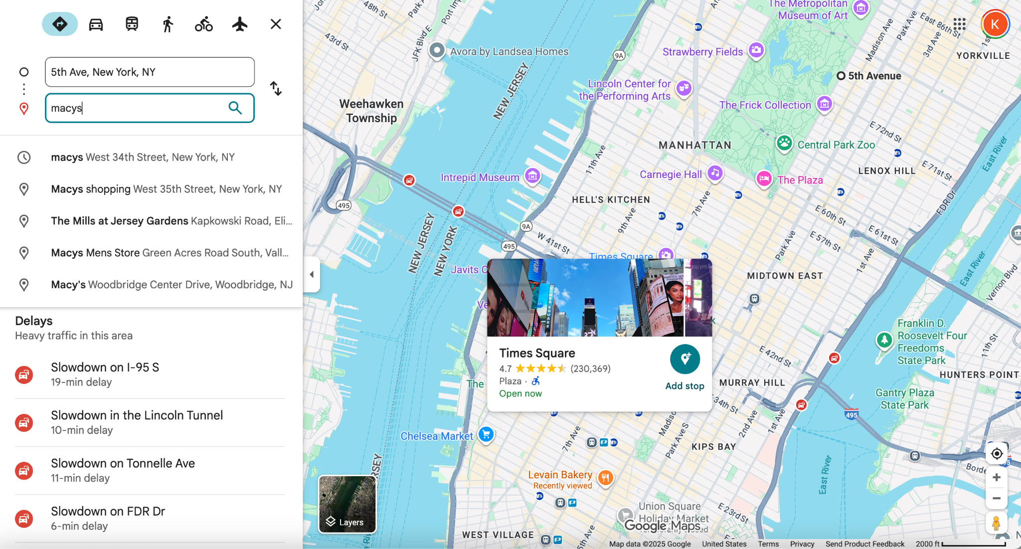
The root cause wasn't bad UI at the surface. It was menu depth and inconsistent labeling buried inside the app. Features existed — participants often knew they should exist — but terminology mismatches between what users expected ("add stop," "transit options") and what the interface labeled them caused people to give up.
Advanced features fail experienced users too.
Participants who opened sessions with "I use Google Maps every day" hit the same walls on setup and configuration tasks as infrequent users. Familiarity with the core experience created false confidence. Moderated sessions made this painfully visible — the best Google Maps users were often the most surprised by what they couldn't find.
Discoverability is the real problem — not feature gaps.
Across all 21 task scenarios, the pattern was identical: the feature was there. The path to it wasn't. This is an information architecture problem, not a missing feature problem. Google Maps doesn't need more capabilities — it needs better wayfinding for the ones it has.
"Method choice shapes what you can see. The heuristic evaluation surfaced labeling issues quickly, but couldn't tell us which ones actually mattered to real users. The survey showed perception gaps, but not behavior. Unmoderated gave breadth; moderated gave depth. None of them alone would have been enough."
Four changes. High-severity first.
05 — RecommendationsWe synthesized findings across all four methods and severity-ranked each issue before settling on four prioritized recommendations. Every recommendation is tied to a specific observed failure — not a general best practice.
Surface multi-step features directly in the active route screen
Add a stop, change transport mode, set departure time — these should be accessible without leaving the active navigation view. Users who needed them most were already mid-journey when they tried to find them, navigating blind while driving.
High severityStandardize terminology between feature names and menu labels
Multiple participants searched for "add stop" or "transit" and couldn't match those terms to what the app actually called the feature. The terminology gap between users' mental models ("Save," "Favorite," "Star") and the app's label hierarchy was a consistent friction source across all four studies. A terminology audit across navigation flows and settings would materially reduce abandonment.
High severityIntroduce progressive disclosure for advanced setup features
Offline maps, multi-modal routing, and arrival time planning don't need to be hidden — they need contextual entry points that surface at the right moment. A first-time-use prompt or contextual tooltip ("Going on a road trip? Download this area for offline use") would surface the feature without cluttering the primary interface for casual users.
Medium severityRedesign the layers panel for discoverability
The layers panel (traffic, satellite, transit overlay, terrain) was consistently missed by participants who were looking for options they correctly assumed should exist. A persistent or more visible entry point — rather than the current icon that's easy to miss — would reduce the number of dead-end searches observed across all five moderated sessions.
Medium severityWhat the process taught me
06 — ReflectionRunning a four-method study in a single semester was genuinely hard. Coordinating five researchers, managing participant recruitment across two study types, and synthesizing findings from 20+ hours of session data — there were things this project taught me that a textbook couldn't.
Moderating requires a different kind of discipline
Staying neutral while a participant visibly struggles — and resisting every instinct to help — is a skill that's harder to practice than it sounds. I had to let two tasks fail completely in my session because intervening would have contaminated the data. That was uncomfortable. It was also exactly right.
Method choice shapes what you can see
The heuristic evaluation surfaced labeling issues quickly, but couldn't tell us which ones mattered to real users. The survey showed perception gaps, not behavior. Unmoderated gave breadth; moderated gave depth. Several findings only became defensible when they showed up across three or four different data sources.
Pilot testing isn't optional
Running a practice session before the real moderated tests uncovered unclear instructions and unnecessary task complexity. It's easy to write a task that makes sense to a researcher but confuses a participant for reasons having nothing to do with the product. The pilot surfaced that gap before it could affect our data.
What I'd do differently
I'd add a card-sorting component early in the study — specifically to test how people mentally organize Google Maps features before they ever interact with the UI. A lot of what we found points to a mismatch between users' mental models and the app's structure. Card sorting would have let us quantify that gap rather than just observe it.