Making science's most-used database actually usable.
A full UX redesign of the RCSB Protein Data Bank help section — tackling poor information architecture, WCAG accessibility failures, and navigation patterns that sent millions of researchers straight to Google instead.
The problem, the solution
01 — At a glanceThe RCSB Protein Data Bank is the US repository for 3D structural data of biological molecules, visited by millions of researchers and students annually. Its help section — the primary support resource for a highly diverse user base — suffered from poor information architecture, accessibility gaps, and navigation patterns that failed both novice and expert users alike.
The RCSB PDB Help Page lacked clear organization, intuitive navigation, and accessible content, making it difficult for users — especially students and new researchers — to efficiently find the support they need. Many users bypassed the help section entirely, turning to Google instead.
A restructured information architecture with 8 logical categories, a search-first approach, hybrid progressive disclosure, and full WCAG 2.1 AA compliance — balancing the needs of expert researchers and first-time student users within a single system.
Research, IA, wireframing, prototyping & testing
02 — My roleAs one of four designers on the Rutgers UXD Practicum team, I contributed across the full design process — from shaping the research plan to validating the final prototype. This was the most research-intensive project in my portfolio: 16 weeks of structured UX process with real stakeholders and real constraints.
Mixed-Methods Research
Designed and distributed Typeform/Google Forms surveys, conducted stakeholder interviews, and ran unmoderated first-click tests via Optimal Workshop.
Information Architecture
Led restructuring of the flat 40+ link sidebar into 8 logical, labeled categories. Ran card sorting and tree testing to validate groupings with real users.
Prototyping & A/B Testing
Built two distinct help page layouts in Figma and ran A/B testing with 5 moderated participants to determine which navigation model best served both user types.
Accessibility Audit
Conducted a systematic visual design audit documenting WCAG 2.1 AA violations — contrast failures, missing ARIA labels, small tap targets, and keyboard navigation gaps.
Usability Testing
Facilitated moderated and unmoderated testing sessions (5 + 15 participants) to validate the redesign against baseline metrics before and after iterating.
Visual Design
Redesigned typography hierarchy, spacing, color contrast, and interactive component states to meet accessibility standards while improving visual clarity.
Two phases, six methods
03 — ResearchWe used a mixed-methods approach across two phases — discovery and validation — spanning roughly 16 weeks. The goal was to understand not just what users said they wanted, but what their actual behavior revealed about the help page's failure modes.
| Method | What we studied | Sample | Phase |
|---|---|---|---|
| Typeform Survey | Help page usage, search behavior, content preferences | 20+ respondents | Discovery |
| Google Forms Survey | Quantitative usability + satisfaction ratings | 15 respondents | Discovery |
| Stakeholder Interviews | Moderated sessions with active PDB users | 5 participants | Discovery |
| Unmoderated Testing | First-click tests via Optimal Workshop | 15 participants | Validation |
| Competitive Analysis | UniProt, PDBe, Ensembl, NCBI help sections | 4 competitors | Discovery |
| A/B Prototype Testing | Two help page layouts compared in Figma | 3 moderated sessions | Validation |
"How might we redesign the RCSB PDB help page so that both novice students and expert researchers can efficiently find the support they need — without compromising on depth or accessibility?"
What the data told us
04 — Key findingsInformation hierarchy
Critical content was buried in long text blocks. Users relied on Ctrl+F to find anything, bypassing navigation entirely.
Sidebar navigation
Labels were unclear — "Explore Structures" and "3D Structures" created confusion about where specific topics lived.
Search failures
The help page search returned inconsistent results. A chemistry professor described it as "50/50 — I either find what I need or end up reading about something completely unrelated."
Accessibility gaps
Visual contrast failures, missing screen-reader labels, no keyboard navigation support, and unlabeled interactive elements throughout.
Expert vs. novice divide
A single flat information architecture served neither group well — experts needed deep reference, beginners needed guided onboarding.
Chemistry Professor, Wayne State University · Usability testing participant
RIT Student, Victoria Greever · Usability testing participant
Two personas, one system
05 — Design processResearch revealed two distinct user groups with fundamentally opposing needs. Designing a single help system that served both without condescending to one or overwhelming the other was the core design challenge.
The Researcher
Persona 01- PhD or faculty level, uses PDB multiple times weekly
- Needs deep reference material, API docs, advanced search guidance
- Frustrated by poor searchability and inconsistent results
- Find specific technical documentation fast
- Access API reference without wading through beginner content
- Reproduce search queries reliably
The Student
Persona 02- Undergrad or early grad student, infrequent PDB user
- Needs step-by-step guidance, visual cues, and FAQs
- Overwhelmed by information density and jargon
- Understand what the help page offers before diving in
- Find a specific answer without reading dense documentation
- Complete a class assignment without calling their TA
From 40+ unlabeled links to 8 logical categories.
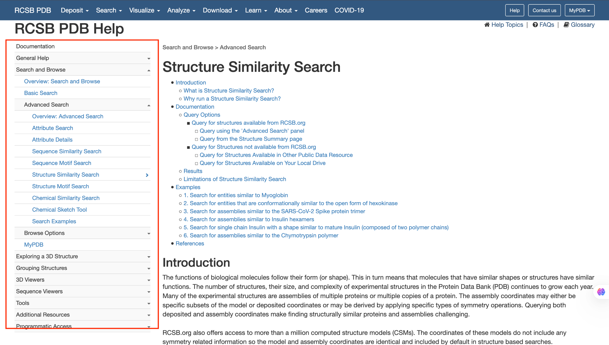
The original flat sidebar had 40+ unlabeled links with no clear grouping. We restructured the help section based on user mental models surfaced through card sorting and tree testing.
Explore Structures
search, browse, sequence/structure/chemical similarity
View & Analyze
summary pages, Mol* viewer, sequence viewers
Tools & Downloads
alignment tools, APIs, batch downloads
Structure Quality
quality assessment, ligand quality, computed models
Deposition
guidance for depositing new structures
Learning & Support
getting started, FAQs, glossary
External Resources
external databases and knowledgebases
Discipline-Specific
crystallography, EM, NMR, structure prediction
The split result that led to a hybrid design.
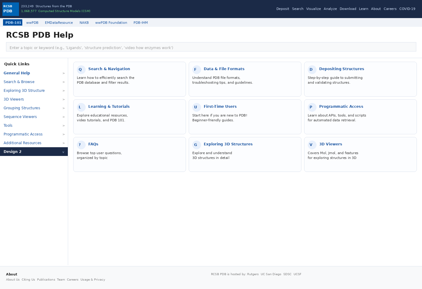
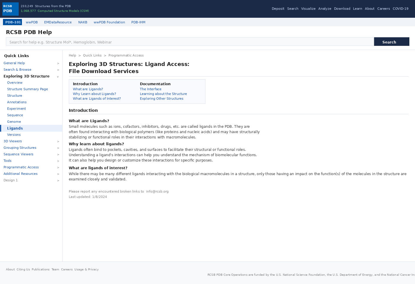
We prototyped two distinct help page layouts in Figma and tested them with 5 moderated participants. Help Page 1 used progressive disclosure (hover-to-expand), while Help Page 2 showed all links inline. Testing revealed a split preference — expert users preferred the density of Page 2, while novice users found Page 1 less overwhelming. The final design incorporated a hybrid approach: visible top-level categories with expandable sub-sections.
No single layout worked for all users. The hybrid approach — top-level categories visible, sub-items expandable — balanced expert efficiency with novice approachability. This became the core structural decision that unified both personas.
Accessibility as a design constraint, not a checklist.
Contrast
Fixed all text/background combinations failing the 4.5:1 WCAG AA ratio — including the sidebar, search bar, and card components.
Screen reader support
Added ARIA labels to all interactive elements, icon buttons, and tooltip triggers that previously had no accessible names.
Tooltips
Added descriptive tooltips to jargon-heavy terms (e.g., "Mol* Viewer", "Ligand Quality") to support novice users without cluttering the interface.
Keyboard navigation
Ensured all interactive elements were reachable via Tab key and had visible focus indicators.
Breadcrumbs
Added clear breadcrumb navigation (Home → Help → Category → Article) to address the disorientation users reported when navigating deep into the help tree.
Every issue documented before a single pixel moved
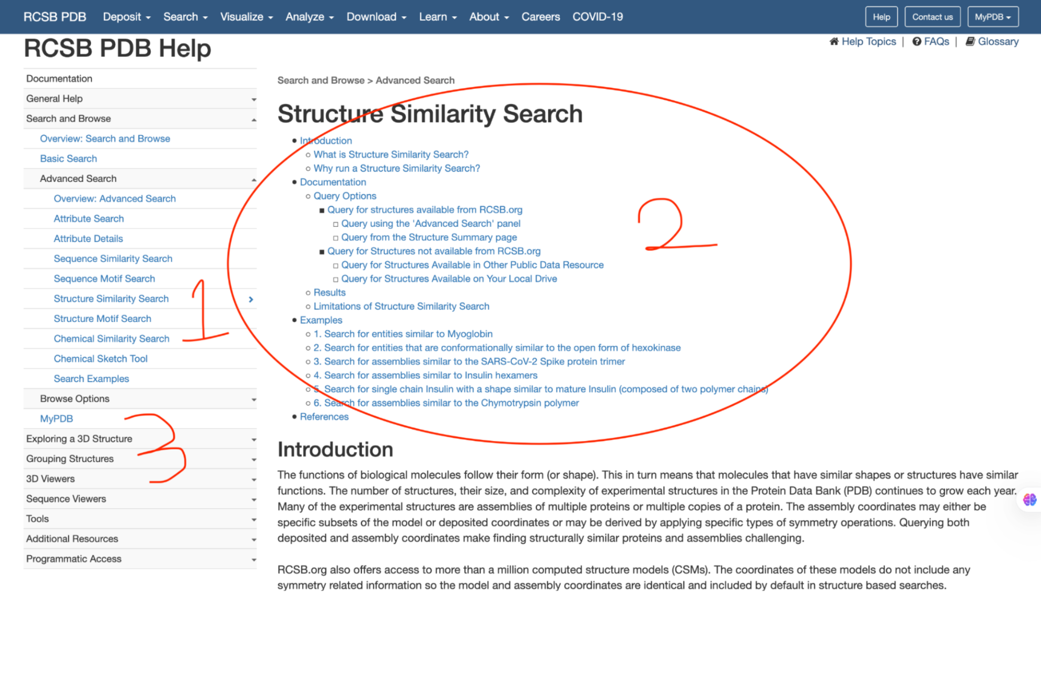
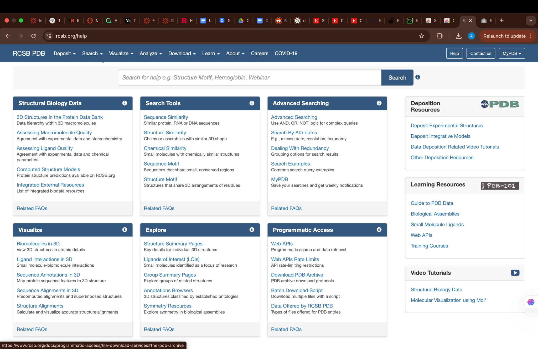
06 — Visual design auditAs part of the research phase, the team conducted a systematic visual design audit of the existing RCSB PDB Help section. Every issue documented below was identified before any redesign work began, and each directly informed a design decision in the final prototype.
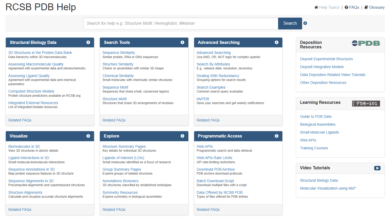
Cognitive Overload — Gestalt & Whitespace
The grid layout organized information into blocks, but right-side sections (Deposition Resources, Learning Resources, Video Tutorials) lacked clear separation — causing cognitive overload. The left-side sidebar clustered related links but insufficient contrast and spacing between subsections created a visually cluttered appearance.
Fix: Consistent negative space around sections, increased paragraph spacing, clear section dividers, and progressive disclosure (collapsible sections) to reduce immediate cognitive load.
WCAG 2.1 AA Contrast Violations
The excessive use of blue across the page lacked sufficient contrast. Lighter shades of blue used in the sidebar navigation failed to meet the WCAG 2.1 AA minimum contrast ratio of 4.5:1 for normal text. 27 elements failed contrast checks across the page.
Fix: Secondary color introduced to visually separate sections. All text/background combinations verified against WCAG 2.1 AA contrast ratios (4.5:1 normal text, 3:1 large text). Color coding used to distinguish navigation, content areas, and links.
Typography — Readability & Hierarchy
Body text size was notably small across content-rich sections. Headings and subheadings provided some structure, but description text and subcategories lacked distinct differentiation. Bullet points under dense content had insufficient visual contrast — difficult to scan and distinguish from body copy.
Fix: Body text size increased. Line spacing set to minimum 1.5x. Bolder subheadings, increased font weight for critical links, improved bullet indentation for clearer content hierarchy.
Navigation Hierarchy — Proximity & Alignment
Navigation elements on the right side lacked visual weight — easy to miss entirely. Left sidebar menu items were cramped together, hindering quick readability and making it difficult for users to parse the information hierarchy at a glance. 43% of users reported bypassing the sidebar navigation entirely.
Fix: Distinct section dividers added. Increased line spacing and improved alignment. Clear breadcrumb navigation (Home → Help → Category) introduced to support user orientation. Navigation restructured into 8 logical categories with descriptive labels.

Measured across 20 test sessions
07 — Outcomes & impactAfter iterative testing with 5 moderated and 15 unmoderated participants, the redesigned prototype showed significant improvements across all key metrics compared to the original help section.
| Metric | Before | After | Change |
|---|---|---|---|
| Task success rate | 70% | 95% | +25pp |
| Average task completion time | Baseline | –20% faster | Faster |
| User error rate | Baseline | –30% errors | Fewer errors |
| Help page discoverability | 43% bypassed | Improved findability | IA restructure |
| Accessibility compliance | Multiple AA failures | WCAG 2.1 AA | Compliant |
Hybrid progressive disclosure
A/B testing showed no single layout worked for all users. The hybrid approach — top-level categories visible, sub-items expandable — balanced expert efficiency with novice approachability.
Search-first IA
57% of users had never used the help page because they couldn't find it or find anything in it. Making the search bar prominent, with predictive suggestions and accurate results, was the single highest-impact change.
Accessibility as a core constraint
Rather than treating WCAG compliance as a checklist at the end, accessibility considerations shaped component choices from wireframe stage — particularly for contrast, labeling, and keyboard interaction patterns.
Breadcrumb navigation
Multiple users reported feeling lost when navigating deep into help topics. Breadcrumbs reduced disorientation and improved users' mental model of the site structure.
The redesigned help system
08 — Final screensThe final prototype addressed every identified pain point — a search-first homepage, restructured 8-category navigation, WCAG-compliant components, and breadcrumb wayfinding throughout. Two design variants (Design 1 and Design 2) were tested and merged into a hybrid approach.
Click through the full interactive redesign — both Design 1 and Design 2
variants — on Figma.
Open in Figma →
What 16 weeks of real UX work taught me
09 — ReflectionThis was the most research-intensive project in my portfolio — 16 weeks of structured UX process with real stakeholders, real users, and real constraints. A few things stand out.
Designing for expertise diversity is genuinely hard
Most UX projects have a fairly narrow user profile. RCSB served everyone from a high school student doing a biology assignment to a protein crystallographer with 20 years of experience. A single IA that serves both without condescending to one or overwhelming the other required multiple rounds of testing and real willingness to throw out early assumptions.
Accessibility is a design decision, not a QA step
The contrast failures and missing screen-reader labels we found weren't edge cases — they affected core navigation. Treating accessibility as a constraint during wireframing, rather than a retrofit at the end, produced better outcomes and fewer revisions. This principle now shapes how I approach every project from day one.
Users lie about their behavior — watch what they do
Multiple participants said they "sometimes use the help page" in surveys, but observation sessions revealed they went straight to Google or used Ctrl+F. That gap between stated and actual behavior shaped the entire IA strategy — and reinforced why I trust behavioral data over self-reported data every time.
Prototype testing revealed unexpected insights
The A/B test between Help Page 1 and Help Page 2 produced split results we didn't anticipate. Rather than treating that as a problem, we used it to understand the underlying reason — and that led to the hybrid design that outperformed both original versions. Unexpected results are data, not failures.