Making campus transit legible for everyone.
A contextual inquiry study into how Rutgers students navigate campus using RU Radar — and a prototype that rethinks the final mile from bus stop to destination.
RU Radar is useful — until it isn't
01 — The appRU Radar is an iOS-exclusive campus bus tracking app built specifically for Rutgers University students. It shows live bus locations, real-time arrival estimates, and route status. For a single-route trip, it's fast and reliable. But the moment a student needs to plan a multi-stop journey or figure out the last mile on foot — the app leaves them stranded.
The app has no destination search. No transfer planning. No walking directions after you step off the bus. Android users are locked out entirely. The result: students memorize routes, improvise on arrival, and supplement with Google Maps for everything RU Radar can't do.
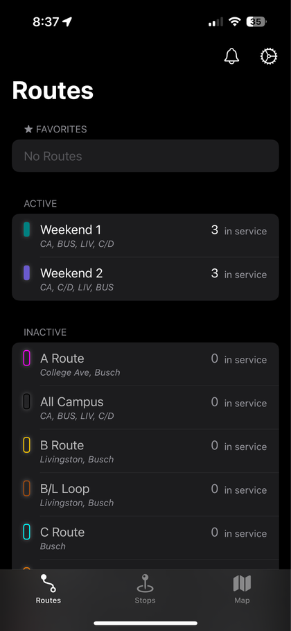
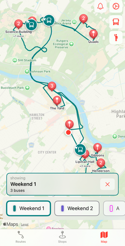
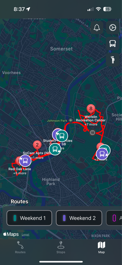
Where RU Radar stands against the alternatives:
RU Radar
Pros: Live bus locations · Clean, focused UI · Rutgers-specific routes
Cons: iOS only · No destination search · No transfer info · Inaccurate ETAs
Google Maps
Pros: Destination search · Turn-by-turn walking · Transfer planning · Cross-platform
Cons: Rutgers bus data often stale · Not campus-aware
PassioGo
Pros: Shows driver break status · More accurate stops
Cons: Complex UI · Less familiar to students · No walking directions
Phenomenological contextual inquiry
02 — Research approachWe conducted a phenomenological study — exploring the lived experience of using RU Radar, not just measuring task success. Six Rutgers students were interviewed over Zoom, each walking through three structured tasks while thinking aloud. Interviews were recorded, transcribed, and interpreted as a team.
Participant 1
23 · Male · Data Science MS / 7 months at Rutgers · No car
Participant 2
27 · Female · Graduate student / 1.5 years at Rutgers · No car
Participant 3
25 · Male · Graduate student / Near bus stop · Daily rider
Participant 4
22 · Female · Undergraduate / Regular commuter · Has car
Participant 5
24 · Male · Graduate student / Near bus stop · Daily rider
Participant 6
23 · Male · Graduate student / Near bus stop · Frequent rider
Three tasks of rising difficulty:
Route Tracking Easy
Track routes EE, A, and B on RU Radar. Find the current position of buses and locate capacity info. This task tested the app's core function — the one it does best.
"It is easy to view, initially it was difficult, but once I got familiar with the routes, it got easy." — P2
No-Transit Trip Planning Moderate
Plan a trip from Rutgers University Inn to Busch Student Center — a single-bus route with no transfers needed. Most found this possible but slow due to no destination search.
"If it can show me the distance and ETA to walk to the nearest stop, it would be much better." — P1
Transit Planning with Transfer Hardest
Plan a trip from Rutgers University Inn to the SERC Building — requiring a transfer between routes. Nearly every participant found this task too difficult or impossible without Google Maps.
"It doesn't show me the buses I need to take to go from Rutgers Inn to SERC. I need to manually check which buses go there." — P1
What participants told us
03 — Interview findingsAcross all six interviews, a consistent picture emerged: RU Radar is reliable for checking bus times, but completely breaks down when students need to go somewhere unfamiliar. The pain wasn't frustration with the app's core — it was the gap between "I know the bus is coming" and "I know how to get where I'm going."
Participant 1 · Master's in Data Science
Participant 1 · on feature gap vs. PassioGo
No Destination Search
The most frequently requested feature. Students can't type a destination and get a route — they have to manually find the right bus themselves.
Inaccurate ETA
The app's arrival estimates don't account for stops along the way or driver breaks — causing missed classes and missed connections.
No Transfer Information
Multi-stop trips require students to manually cross-reference routes. The app gives no guidance on where or when to switch buses.
No Walking Directions
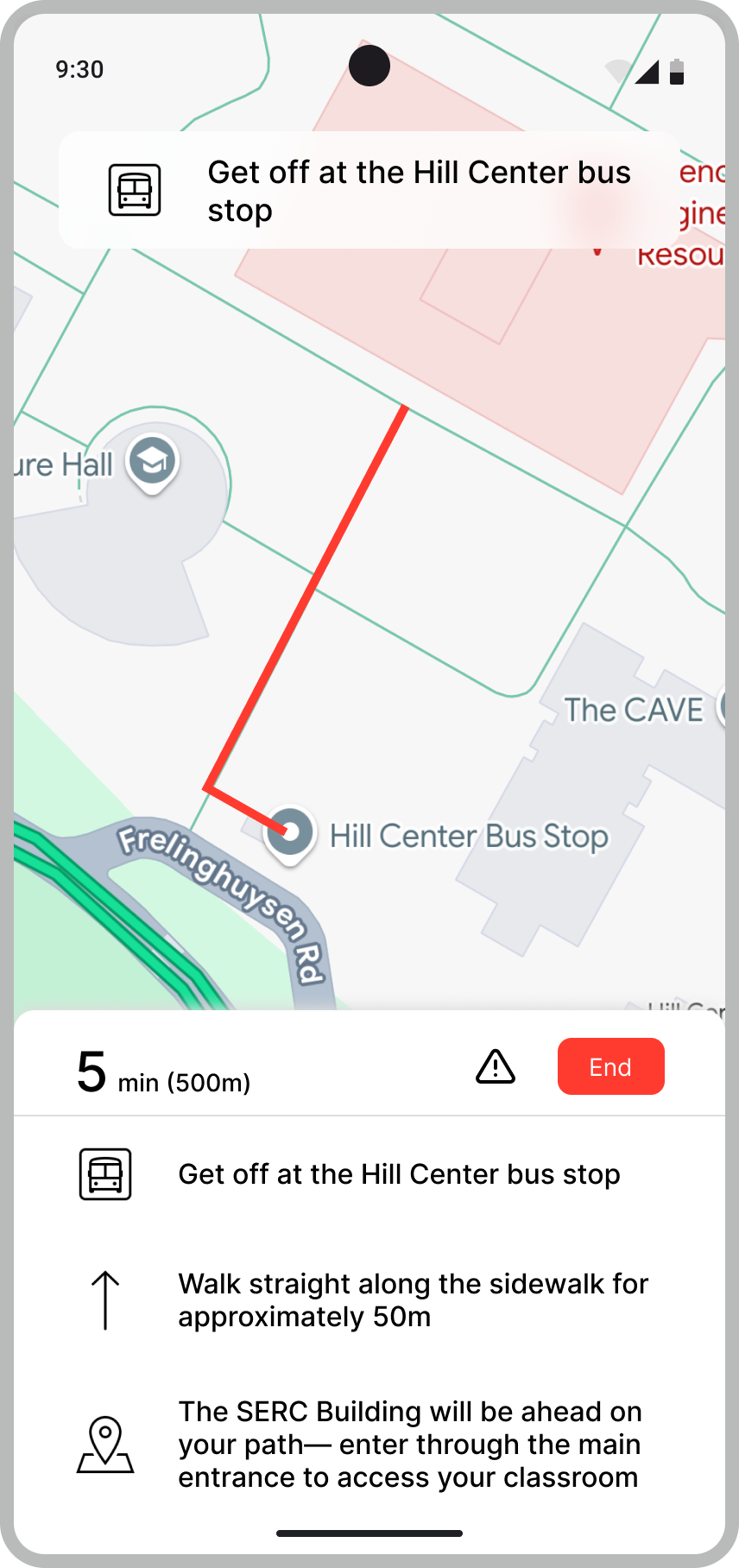
After exiting a bus, students are on their own. No indication of which direction to walk, how far, or which entrance to use.
iOS Only
Android users — a significant portion of the student body — have no access to the app at all, forcing them to rely on Google Maps entirely.
Manual Route Finding
Students must know route names (A, B, EE) before they can use the app. There's no way to search by campus or building name.
In Stage 3 interviews, four of six participants said they would prefer driving if they had a car — revealing that bus reliance is driven by necessity, not preference. The most common requested feature across all participants was destination-based trip planning, followed by improved ETA accuracy.
Interpreting the evidence
04 — Key insightsAfter interviews, the team synthesized findings using an Affinity Diagram and a Day-in-the-Life model — two research tools that help transform individual observations into shared patterns.
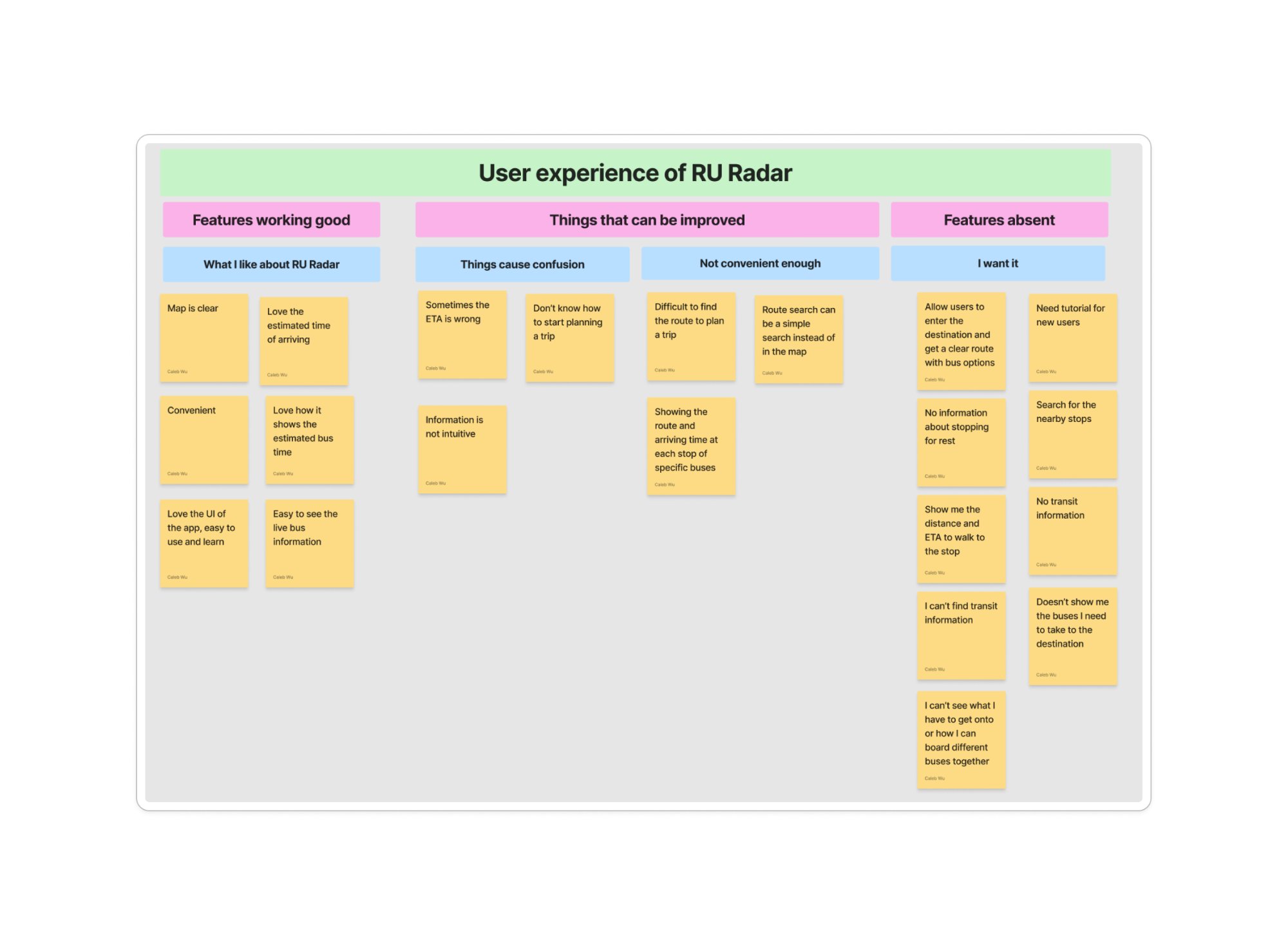
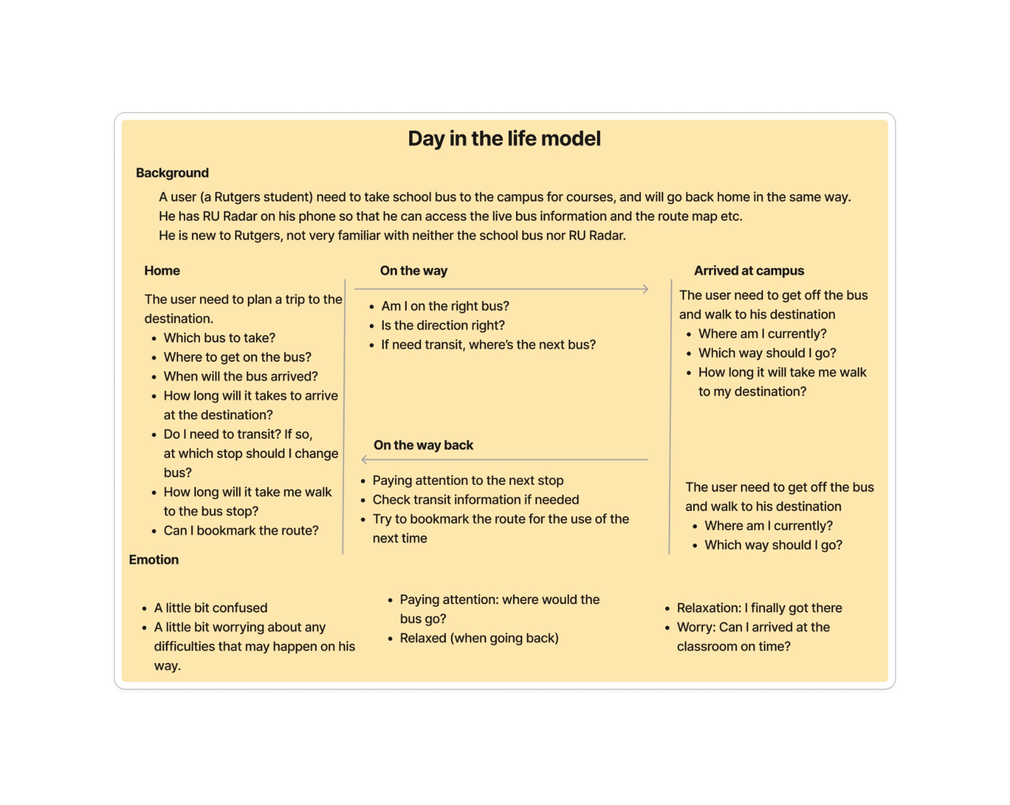
The "Last Mile" Gap
Students consistently reach a dead-end after getting off the bus. The app's job ends at the stop — but the student's journey doesn't.
Route Knowledge as Barrier
The app requires students to already know route names. New students spend weeks learning the system before RU Radar becomes useful.
Dual App Behavior
Most participants use both RU Radar and Google Maps — RU Radar for live tracking, Google Maps for everything else. The app could close this gap.
"How might we extend RU Radar's helpfulness from the moment a student decides to travel — all the way to arriving at the right entrance of the right building?"
From insight to opportunity
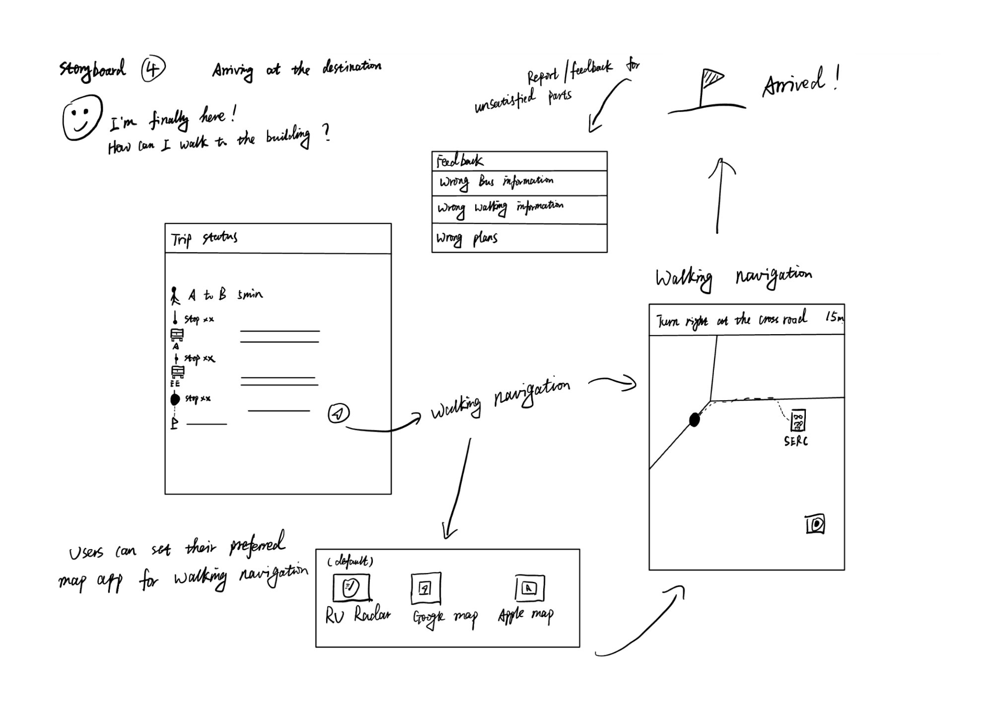
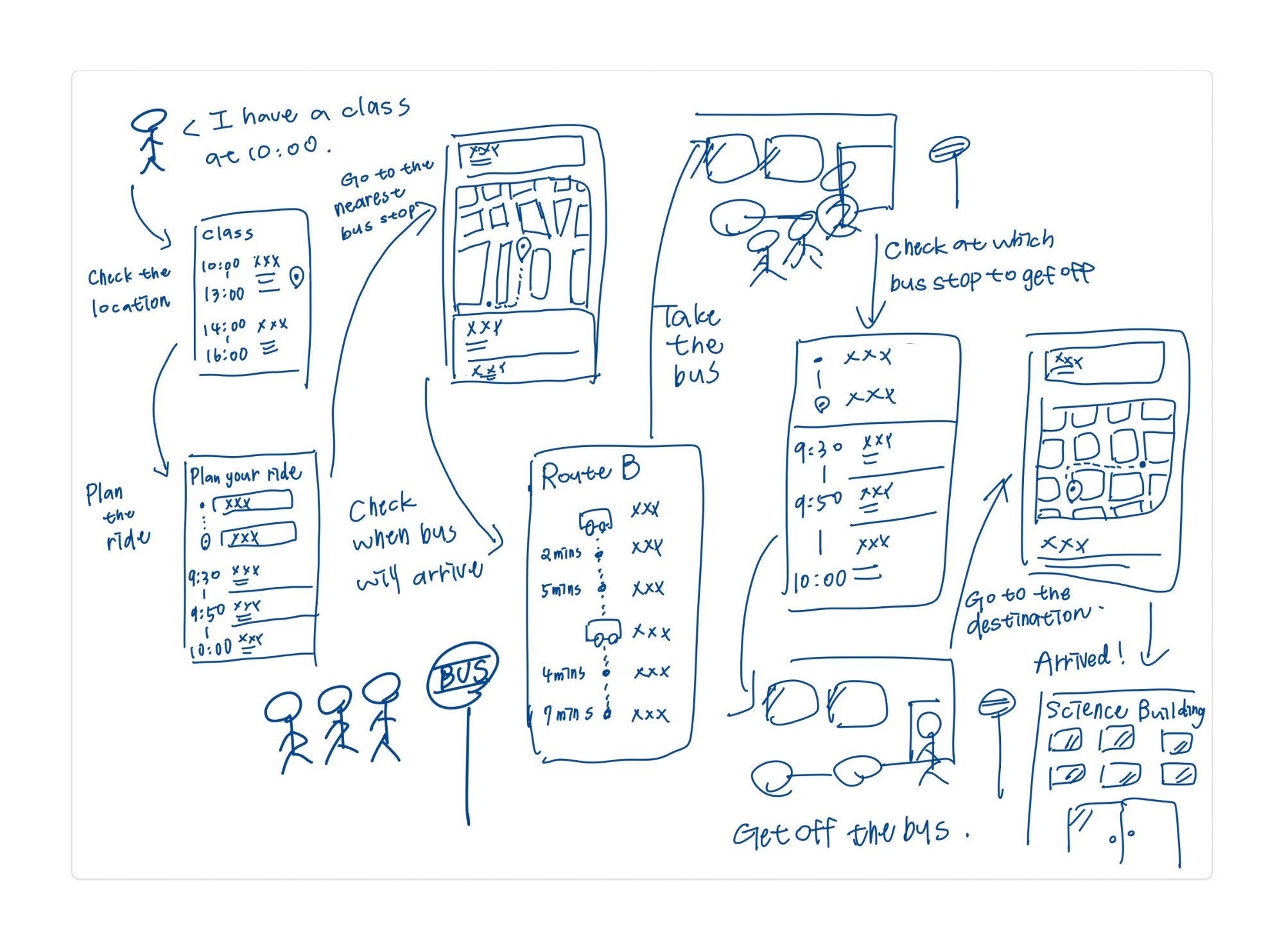
05 — Design opportunitiesThe storyboards below capture the core user journey we designed around: a student deciding to catch a bus, wondering which one to take, boarding successfully, and then facing confusion again at the destination. Each design opportunity addresses one moment in this story.
Final storyboards — four user scenarios.
We developed four storyboards mapping distinct moments in the student journey — from first deciding where to go, to comparing route options, riding the bus, and finally navigating the last mile to their destination.
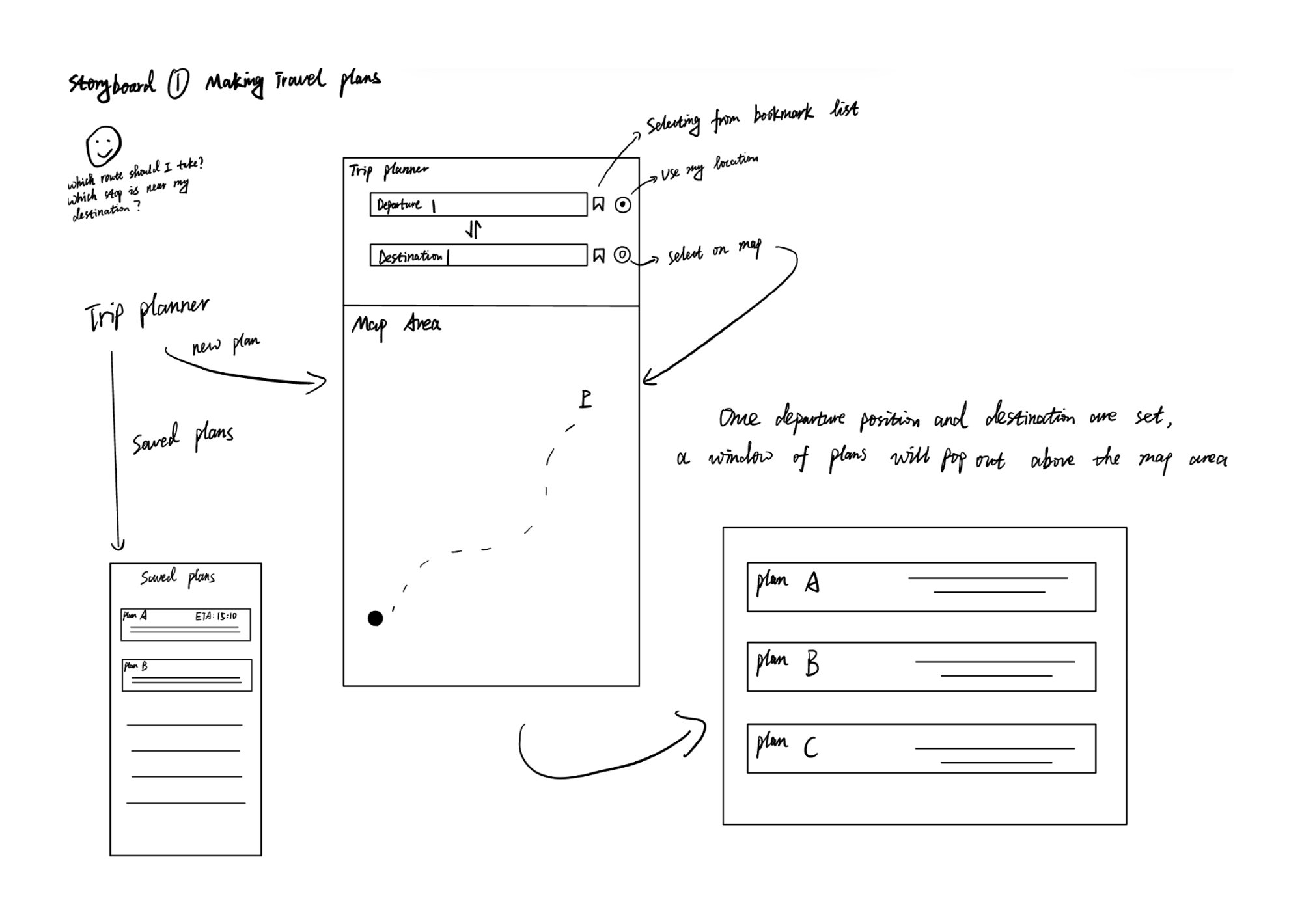
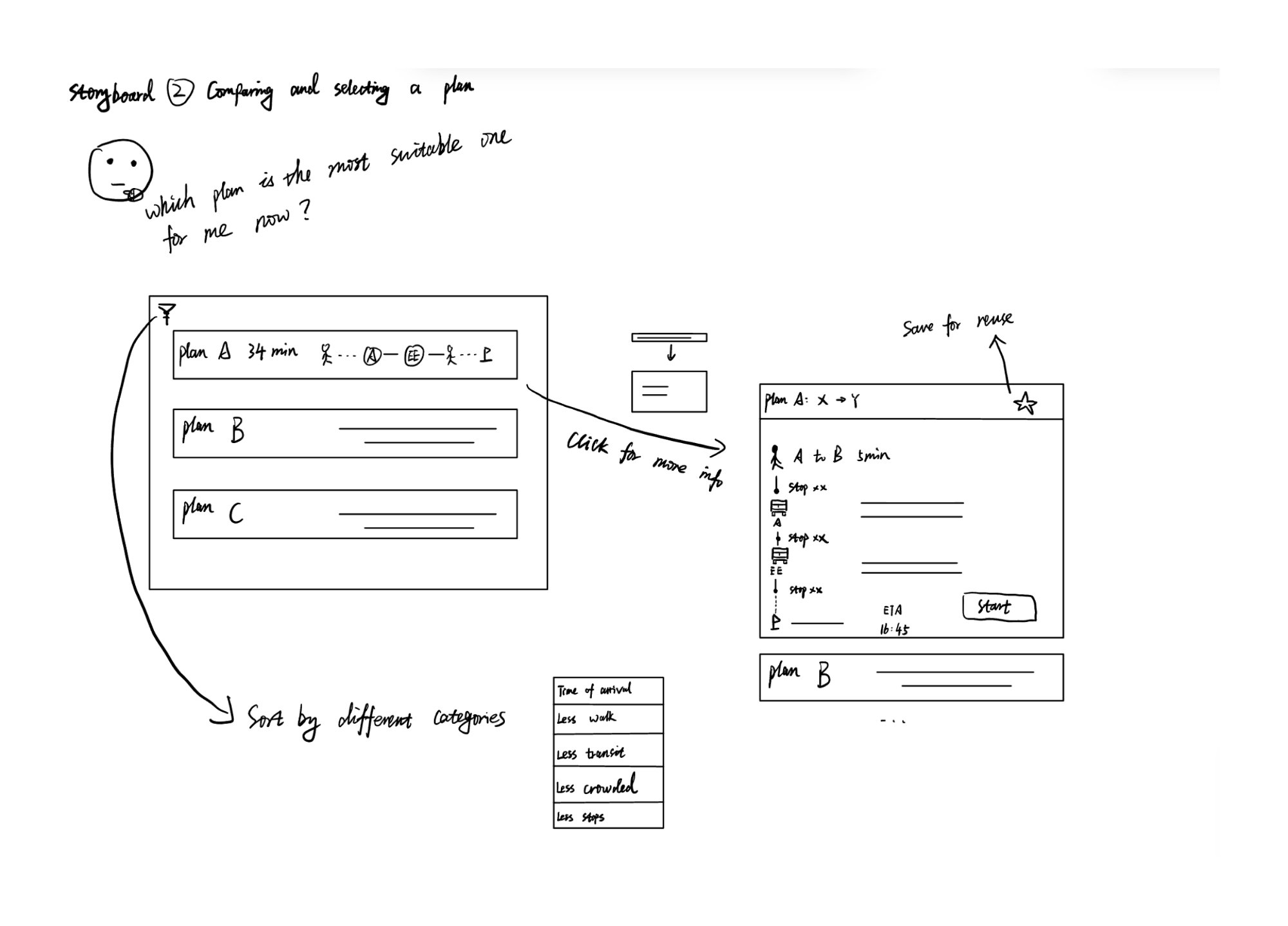
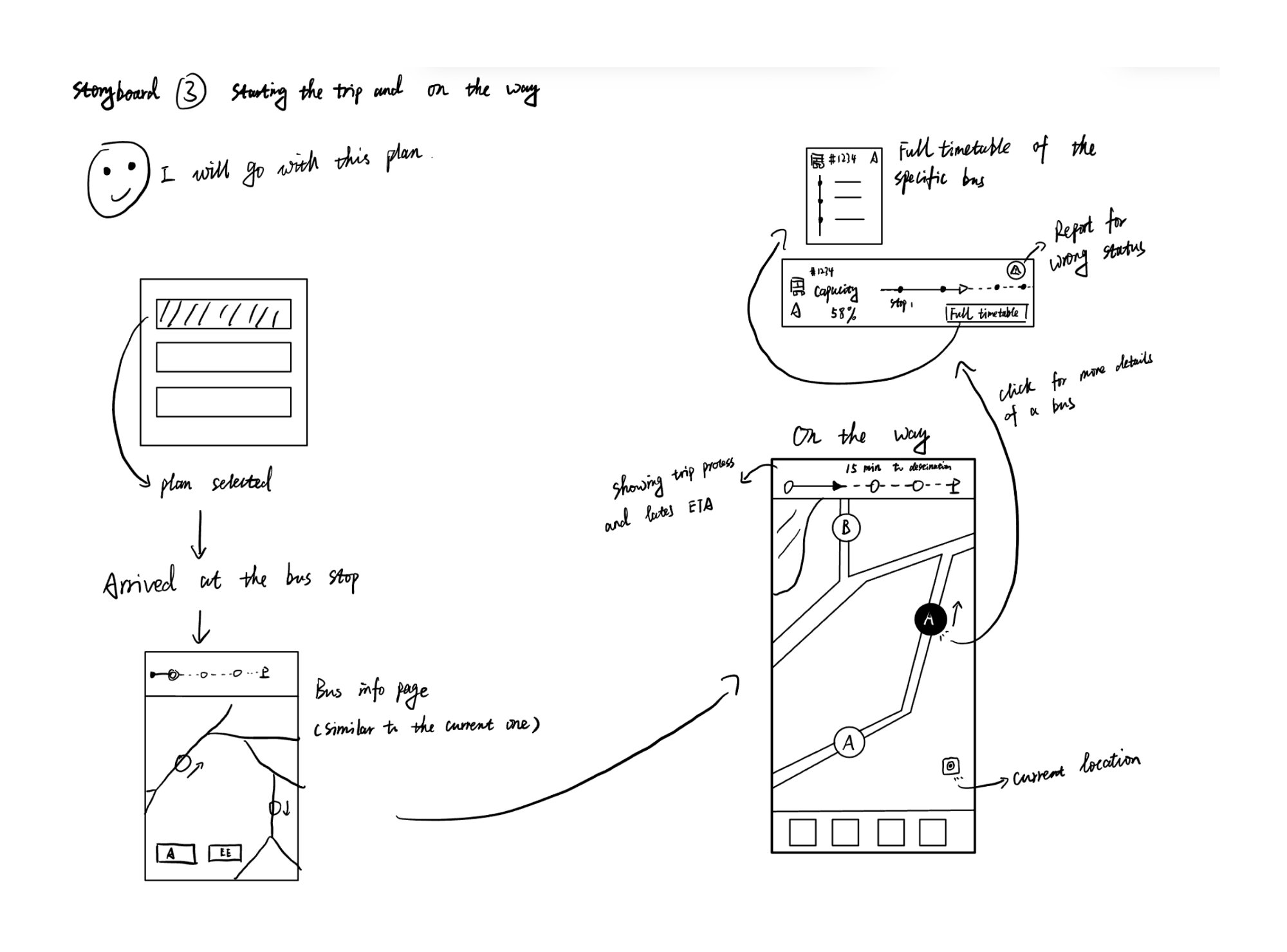
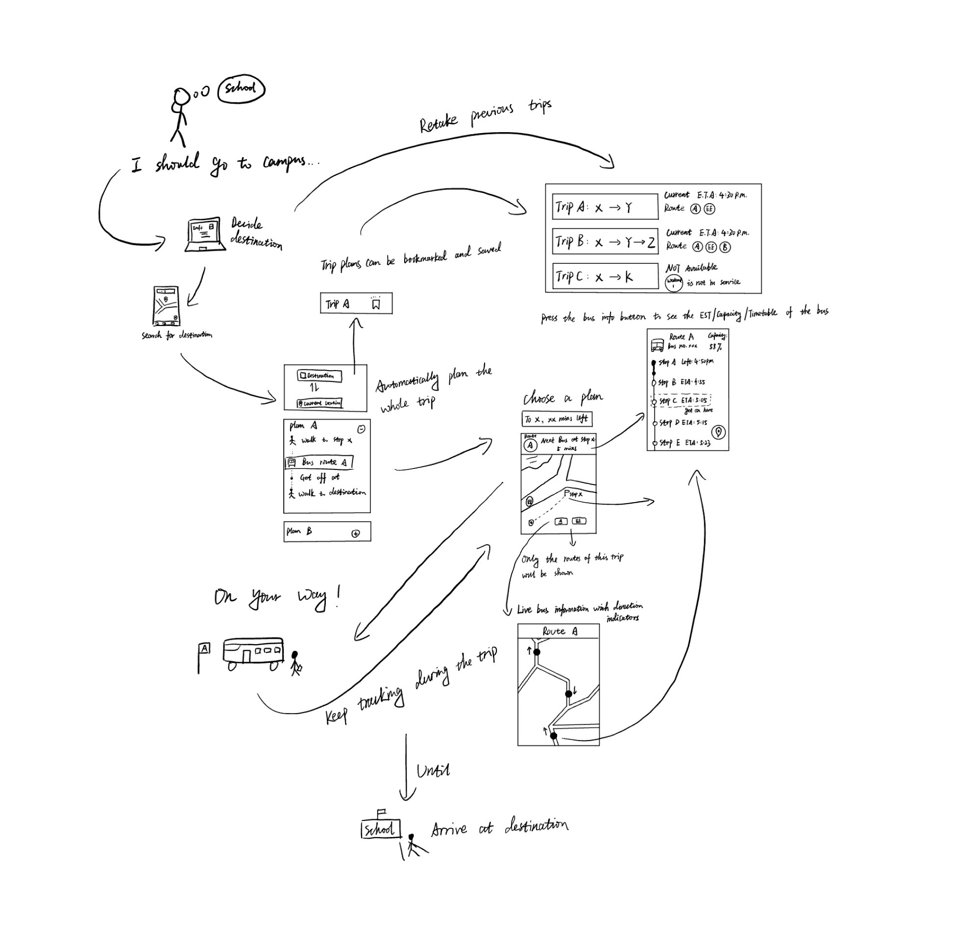
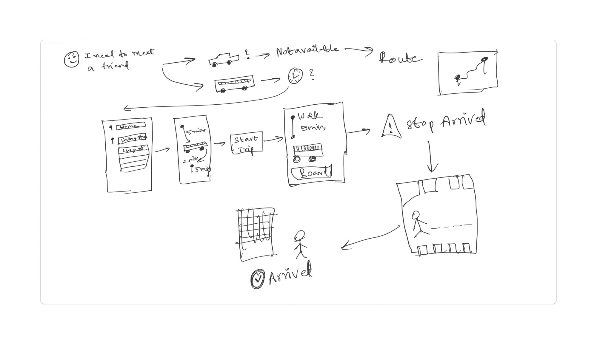
Vision boards — concept exploration.
Before finalising the prototype, the team sketched three vision boards exploring the complete user journey and system architecture — mapping how destination search, trip planning, live tracking, and last-mile navigation could all connect.
Destination Search + Trip Planning
Let students type a campus building or destination and receive a complete bus route — including transfers — without prior knowledge of route names.
Walking Directions After Bus
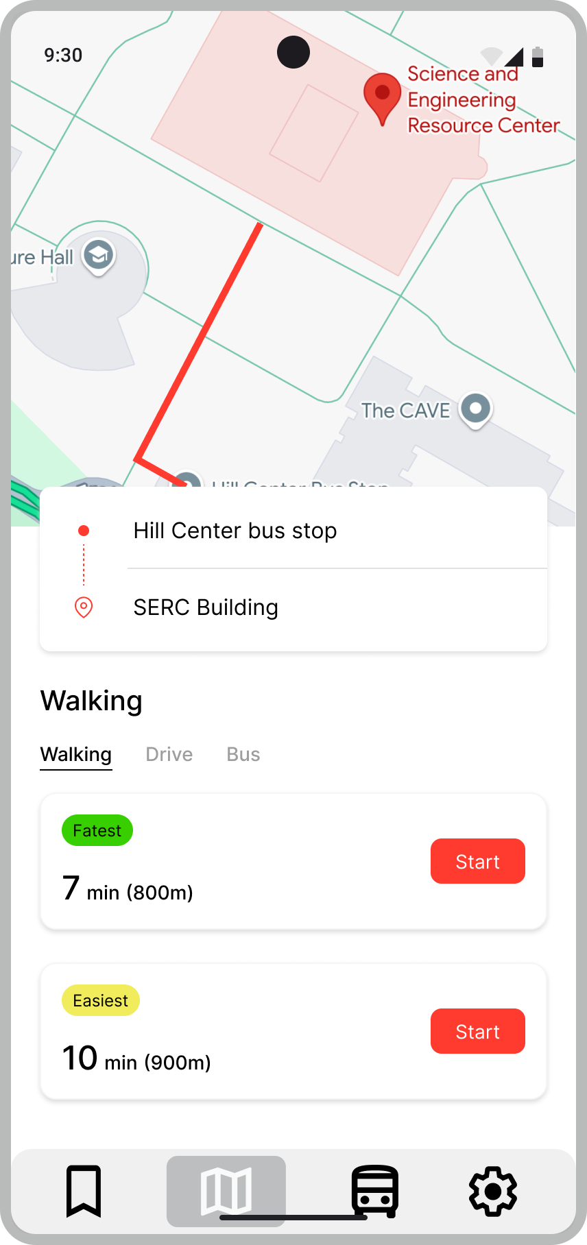
Once a student exits the bus, provide multiple walking route options (Fastest / Easiest) from the stop to their destination with ETA estimates.
3rd-Party Navigation Integration
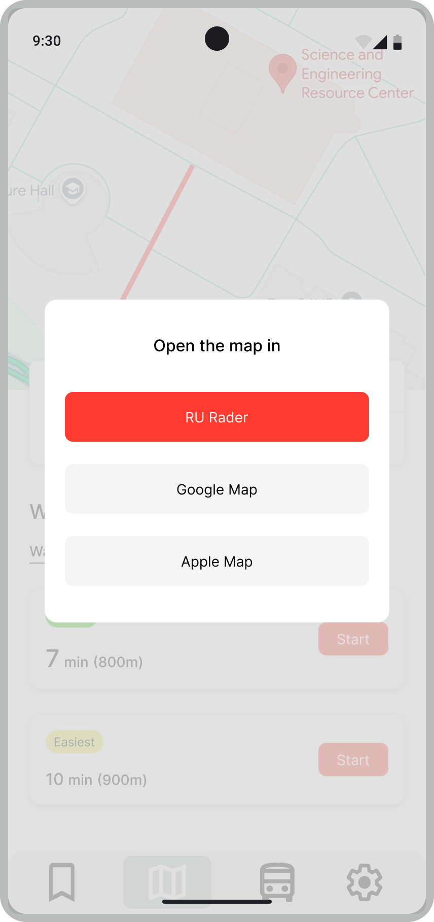
Allow students to hand off to RU Radar, Google Maps, or Apple Maps for turn-by-turn directions — meeting them in the app they already know.
Issue Reporting
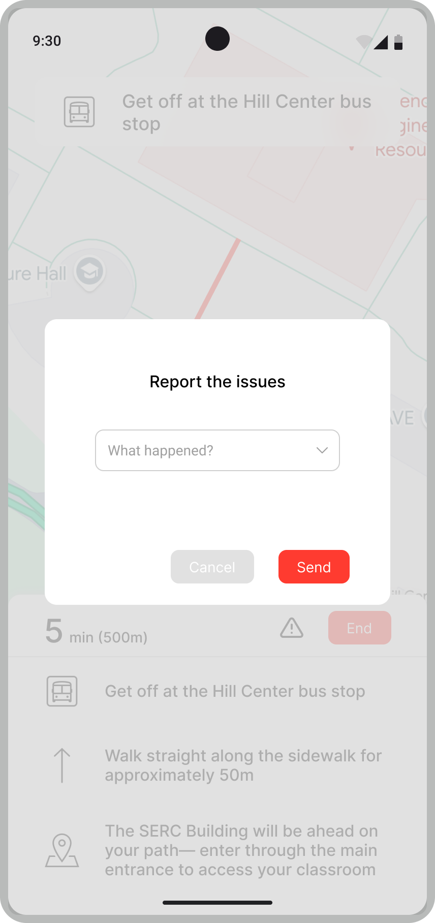
Enable students to report inaccurate ETAs, driver breaks not displayed, or bus overcrowding — building a feedback loop to improve data quality.
Four screens, four solutions
06 — PrototypeThe prototype was tested with two scenario-based interviews. Testers navigated trip planning and issue reporting tasks, and their feedback directly shaped the design iterations. Each screen addresses one identified pain point.
Tester 1 · Task 1 observation → led to adding a clear back/close button
Tester 1 · Task 2 observation → led to adding a confirmation message
What I learned
07 — ReflectionThis was my first deep contextual inquiry study — not just asking users what they think, but observing what they actually do. The gap between what people say about an app and what they struggle with in practice turned out to be the most important thing we uncovered.
Task difficulty reveals mental models
The fact that Task 1 was easy while Task 3 was nearly impossible told us as much as the interviews did. The app's mental model (routes first, destinations never) is misaligned with how students actually think about getting somewhere.
Prototype testing changes your assumptions
We built screens we were proud of — and testers immediately found edge cases we hadn't thought of. The "no clear exit button" and "no submission confirmation" were both surprises that made the final design better.
Integration > replacement
Students didn't want a new app — they wanted RU Radar to do what it does, and also hand off gracefully to other tools. The 3rd-party navigation integration came directly from realizing students already live in multiple apps.
Affinity diagrams make patterns visible
Running the affinity diagram session as a team — not solo — surfaced patterns none of us had seen individually. The "no transit information" cluster emerged from five separate participants saying slightly different things that meant the same thing.
The team & my role
Contextual Inquiry 16:137:532 · Group 7 · Rutgers University · 2025 — with Chia-Chia Lia and Feiyang Wu.
Contextual Interviewing
Conducted and moderated participant sessions, collected verbal and non-verbal data
Affinity Diagramming
Led team synthesis session to cluster interview notes into patterns and themes
Prototype Design
Designed four prototype screens addressing the key journey gaps identified in research
Prototype Testing
Conducted scenario-based usability sessions with new testers to validate design decisions
Research Documentation
Authored participant consent forms, interview protocol, and final research report
Data Analysis
Analyzed transcripts for recurring themes, cross-participant patterns, and design implications