Three people share one job. They should not share one screen.
Sweep is a self-initiated concept for a SaaS operations platform for commercial cleaning and facilities companies. I designed one system and three doors into it — an ops command center, a frontline mobile app, and a client portal — then the marketing site that sells it.
The industry runs on group texts and clipboards
01 — The problemCommercial cleaning is a coordination business wearing the costume of a labour business. The actual product a cleaning company sells is not mopping — it is the promise that a building will be covered, every night, and that someone can prove it was.
Almost none of that promise is instrumented. A no-show at 10pm becomes a phone tree. A client asking "did anyone come Tuesday?" becomes a search through someone's messages. An extra job the client asked for in a hallway conversation becomes an invoice line nobody remembers agreeing to. The failure mode is never one big breakdown — it is a hundred small unrecorded handoffs.
Coverage is discovered late
Nobody knows a shift is uncovered until the cleaner has already failed to show. By then the only lever left is an apology to the client.
Proof lives in someone's camera roll
Work gets photographed, then buried in a personal phone. When a dispute arrives weeks later, the evidence is unreachable.
Extra work has no paper trail
"Can you also do the carpets?" gets agreed verbally and argued about at invoice time. The money conversation happens after the work, not before.
"How might we give an ops manager, a cleaner and a client one shared record of the night's work — without showing any of them things they shouldn't see?"
One job, three completely different jobs-to-be-done
02 — The usersThe temptation in a multi-sided product is to build one flexible interface and hand everyone a different permission set. I ruled that out early. These three people are not doing the same task at different zoom levels — they are doing genuinely different work, in different physical conditions, with different failure costs.
Desktop · dense · triage
Sits at a 1440px screen, watches many sites at once, and needs to spot the one thing going wrong across all of them. Optimises for scanning and speed of action. Reads like a well-run clipboard, not a consumer app.
Mobile · one-handed · on-site
390px, in a stairwell, in poor light, often on bad signal, sometimes not in English. Needs three things and nothing else: where am I, what do I do, how do I prove I did it. Every tap target is 44px minimum.
Responsive · occasional · trust
Opens the product a few times a week, usually because something is wrong or something extra is needed. The design job here is reassurance and a clean paper trail, not efficiency.
Each surface is a deliberate subtraction, not a filtered view. The cleaner app does not contain client contacts or other crews' sites. The client portal does not contain cleaner personal details, pay, or leave. Both state this in plain language at the bottom of the screen, so the boundary is a visible feature rather than an invisible permission.
The two-lane model for client requests
03 — The core product decisionThe hardest decision in this project had nothing to do with layout. When a client wants something done, there are two completely different things they could mean — and collapsing them into one "request" button is where the trust in this industry actually breaks.
Either the work was already paid for and it wasn't done properly, or the work is new and someone has to agree on a price. One of those is a complaint the vendor owes you for free. The other is a purchase. If a client fires off a "request" without knowing which lane they're in, they either get billed for something they thought was covered, or they sit waiting for a fix that was actually a quote.
So I split them at the navigation level, gave them different colours, different language, and a cross-link on each page pointing at the other one.
Report a service issue
Contracted work was missed or done poorly. Never generates a charge.
- Client picks which contracted service failed, from their actual contract
- Outcome states are Under review → Rework scheduled → Resolved
- Every card repeats "No charge — covered by your contract"
Submit an additional request
Work outside the contract. Always quoted before it is scheduled or billed.
- Client picks trade, urgency and a preferred window
- Outcome states are New → Quoted → Approved / Declined → Scheduled
- A countdown chip shows how long the quote stays valid

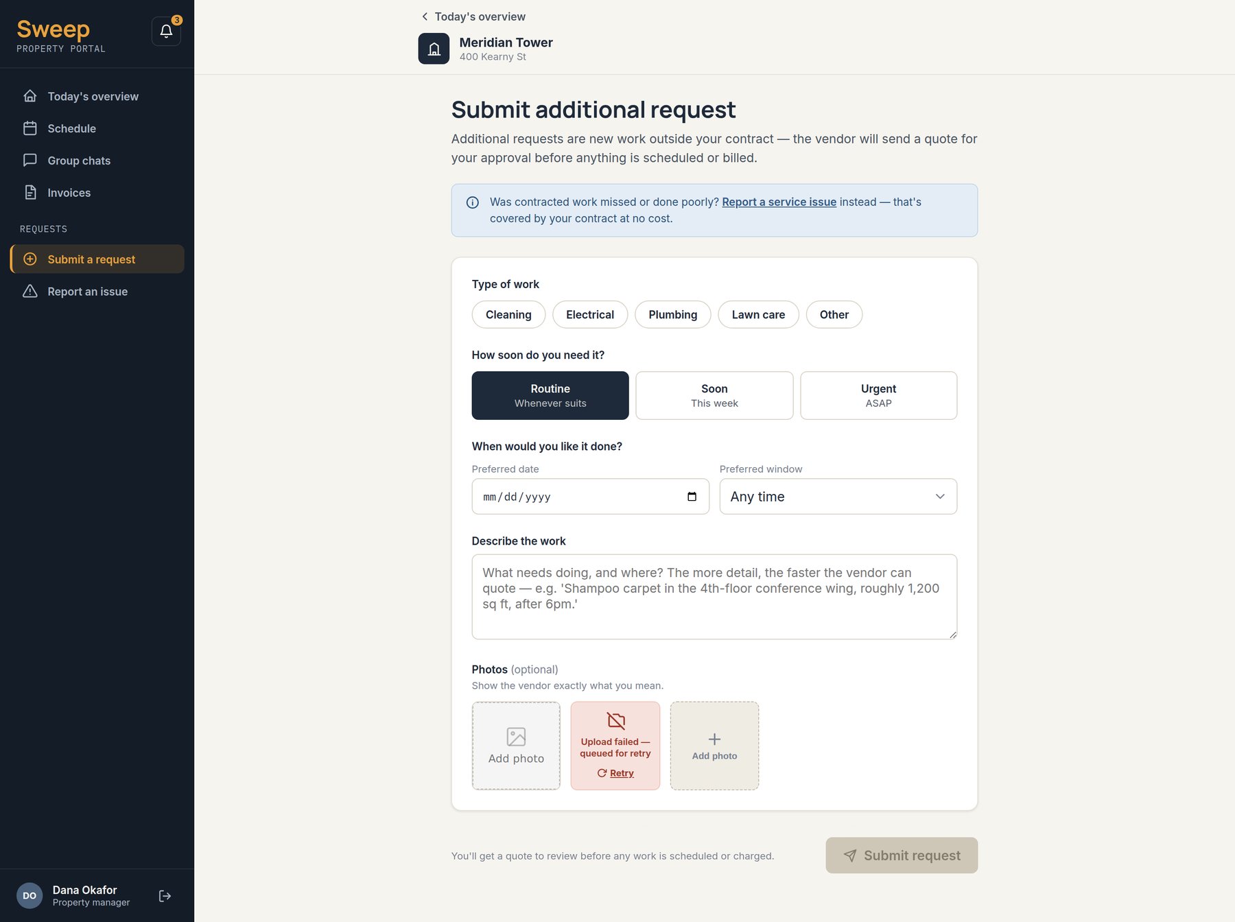
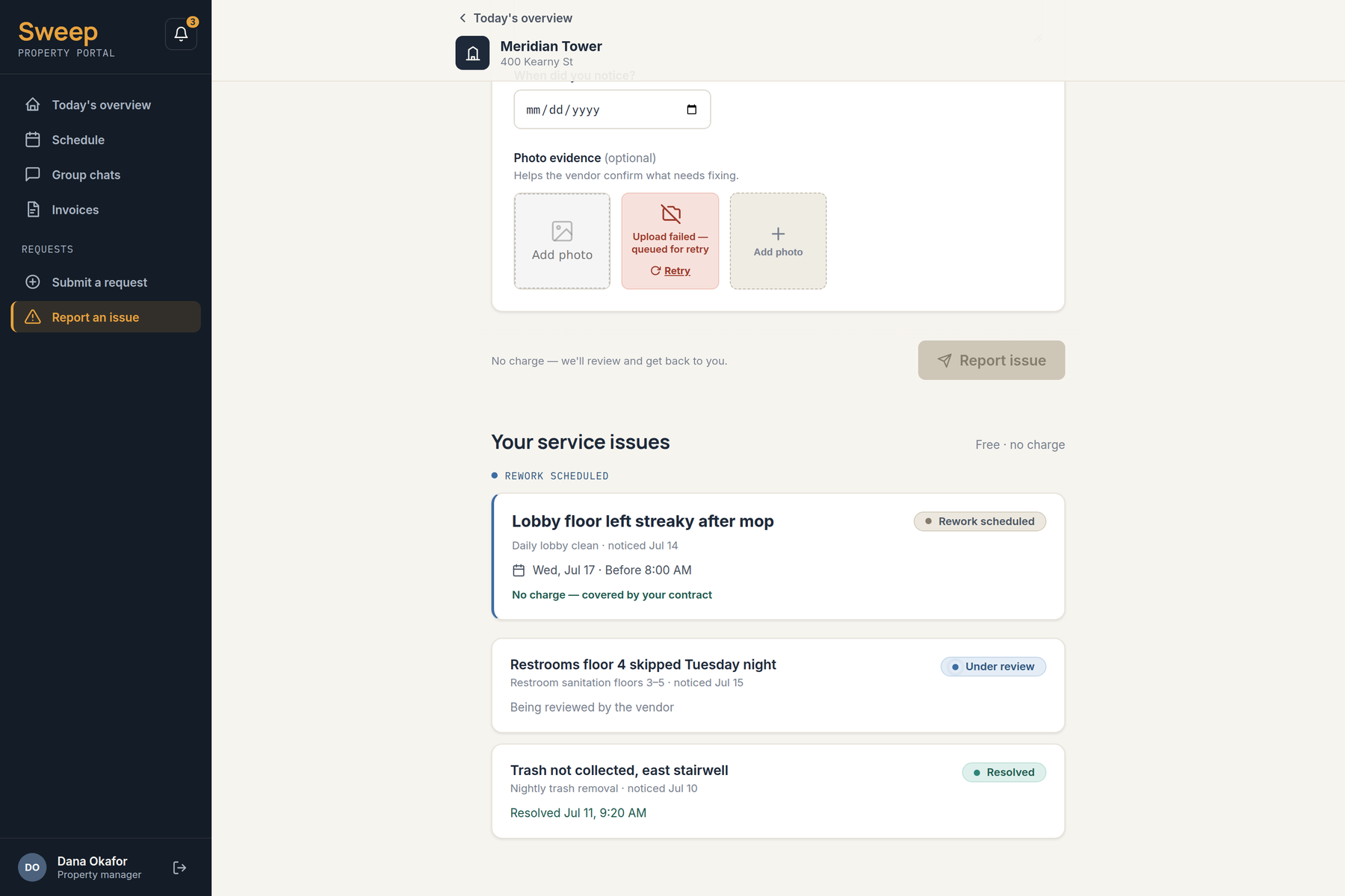
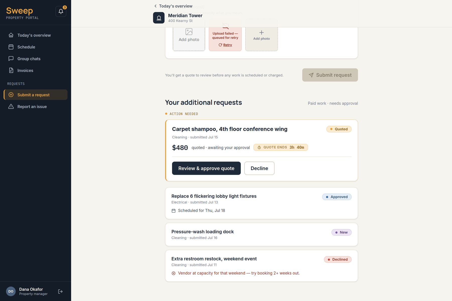
Everything downstream inherits this split. The ops dashboard has two separate inboxes rather than one queue. The invoice screen lets a client dispute a single line item instead of the whole invoice. A billing model turned out to be an information architecture problem.
"Hi-vis navy" — a system built for bad lighting
04 — The design systemI built the system before any screens, because three surfaces at three densities only stay coherent if the tokens decide it rather than my memory. The visual brief I wrote for myself was a well-run clipboard: cream paper, deep navy ink, and exactly one hi-vis colour that does all the pointing.
Cream, not white
The page background is warm cream rather than white. It is softer under the fluorescent light of a service corridor and on the cheap Android handsets crews actually carry.
One accent, rationed
Amber is reserved for the single most important action or signal on a view — the hero CTA, an at-risk shift, the active tab. It is never decorative, and never used as text on cream because it fails AA there.
Status is never colour alone
Six job states, each carrying a colour, a dot and a written label. The system survives greyscale, colour-blindness, and a phone screen in direct sunlight.
Two density modes
Compact for the ops desktop — 32px controls, 40px rows. Comfortable for the cleaner's phone — 44px everything, which is the tap-target floor, not a preference.
Numbers are monospaced
Every time, hour count, shift code and dollar figure is IBM Plex Mono with tabular figures, so a live-updating dashboard does not jitter as digits change.
Motion only when functional
140ms for state changes, 220ms for entrances, 320ms for exits. No glassmorphism or backdrop blur — it degrades badly in poor light and on low-end devices. Everything collapses to 0ms under reduced motion.
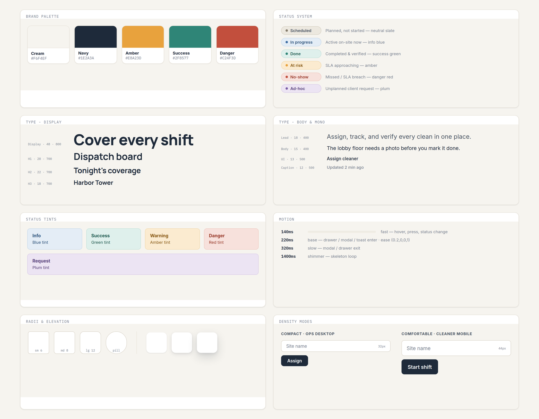
The library that came out of it is thirteen components — Button, Input, Select, StatusBadge, SLAChip, ShiftCard, WorkerRow, ChecklistItem, Tabs, Toast, Modal, Skeleton and EmptyState — plus six token files. Two colours in the palette exist only because the status system needed them: info blue for in progress and plum for ad-hoc request, both added so those states could not be confused with amber at risk.
Surface one — the ops command center
05 — Ops managerThe ops manager's screen answers one question before any other: what is going wrong right now, across every building I am responsible for?
So the dashboard opens with an urgent band pinned above everything else, sorted by severity, before the user has picked a site. Only underneath that does the layout become per-site: live staff on shift, the two request lanes, contracted services with their last-completed times, and an editable financial summary.
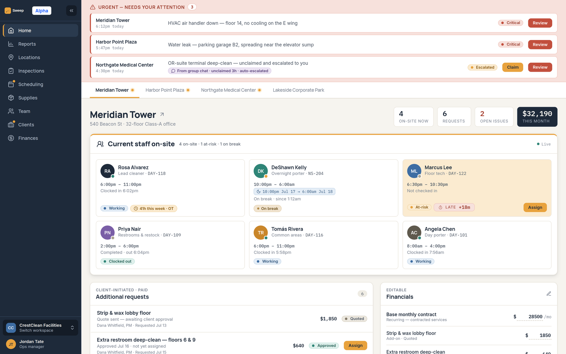
At-risk before no-show
A worker who has not checked in 18 minutes into their window is amber and "At-risk · LATE +18m", with an Assign button already on the card. The state exists so the manager acts during the window rather than after it.
Overtime shown at the moment of assigning
Worker cards carry a running weekly total — "41h this week · OT" — so the cost of a reassignment is visible at the point of the decision, not in a payroll report next month.
Overnight shifts written honestly
A 10:00pm–6:00am shift is labelled with both dates. Split shifts and shifts crossing midnight are the norm in this industry, and a calendar that silently truncates them is worse than no calendar.
Contracted work has a last-completed column
The recurring services table shows frequency, window and when it last actually happened — including "Missed Jul 16" in danger red. It is the vendor's own honest record before the client ever asks.
Surface two — the frontline app
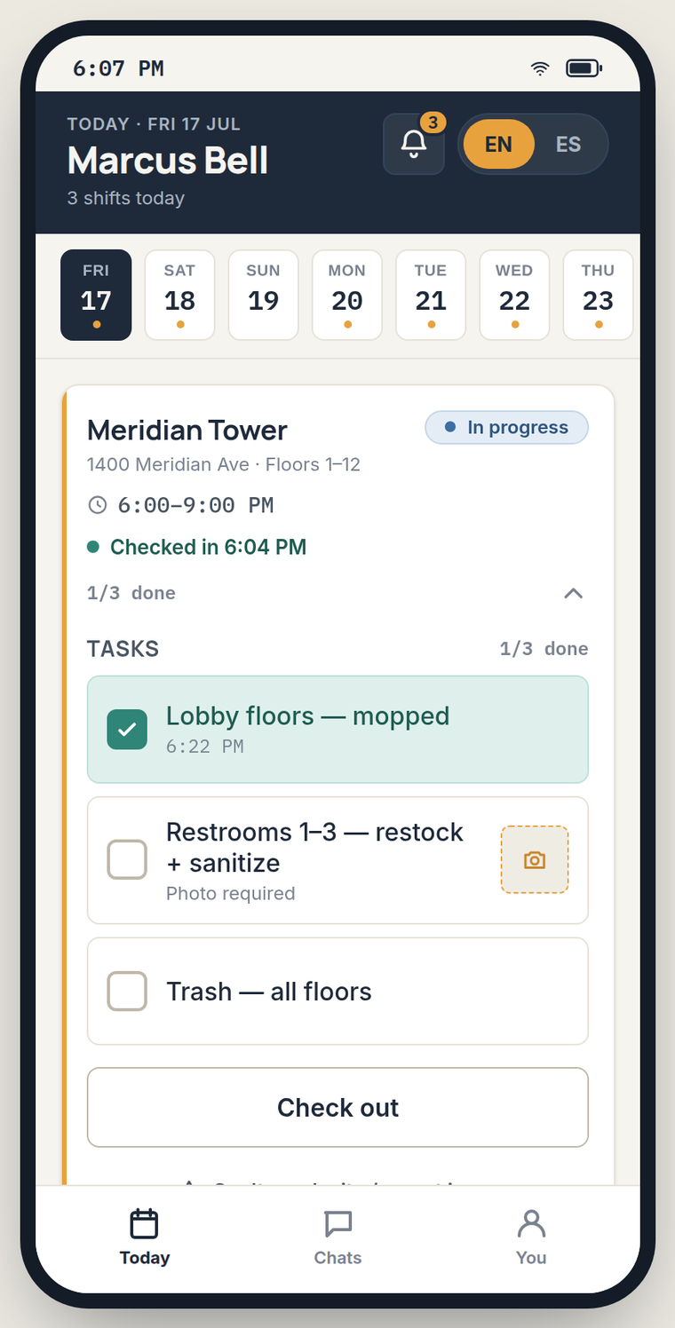
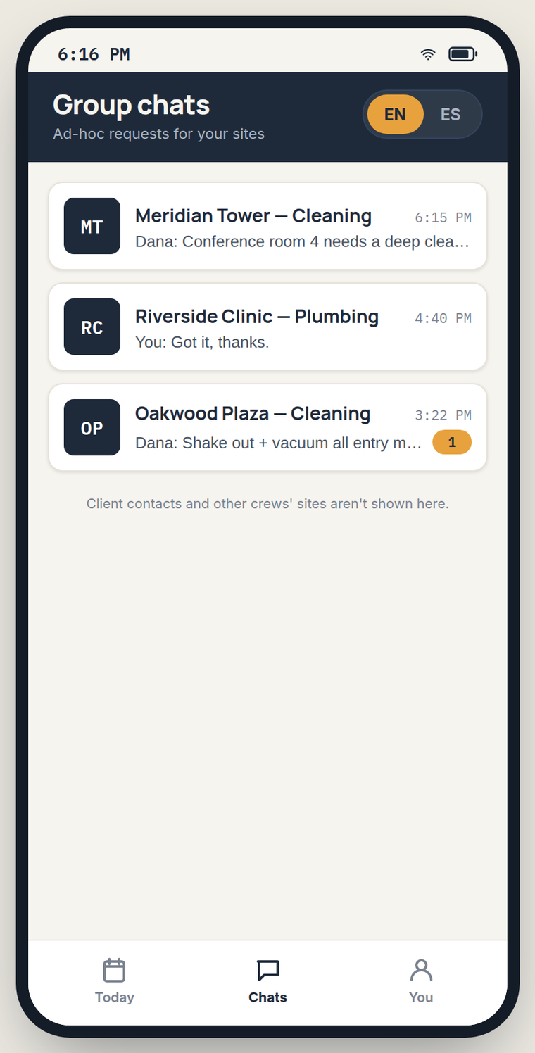
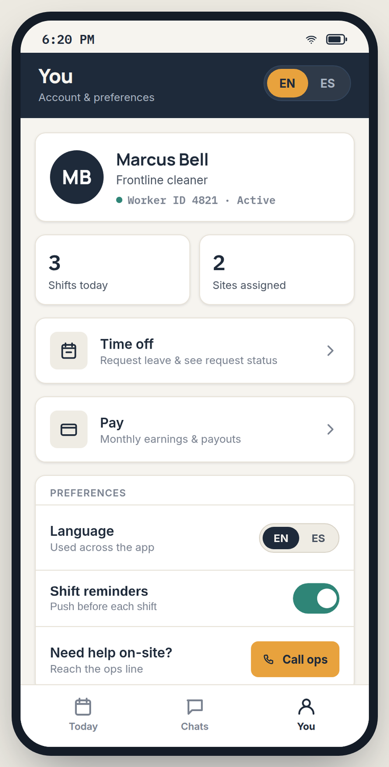
06 — Cleaner mobileThis is the surface I was strictest with. It has three tabs — Today, Chats, You — and I rejected everything that did not survive the question: would a cleaner standing in a service corridor at 11pm need this in the next thirty seconds?
Offline is the assumed state, not the error state
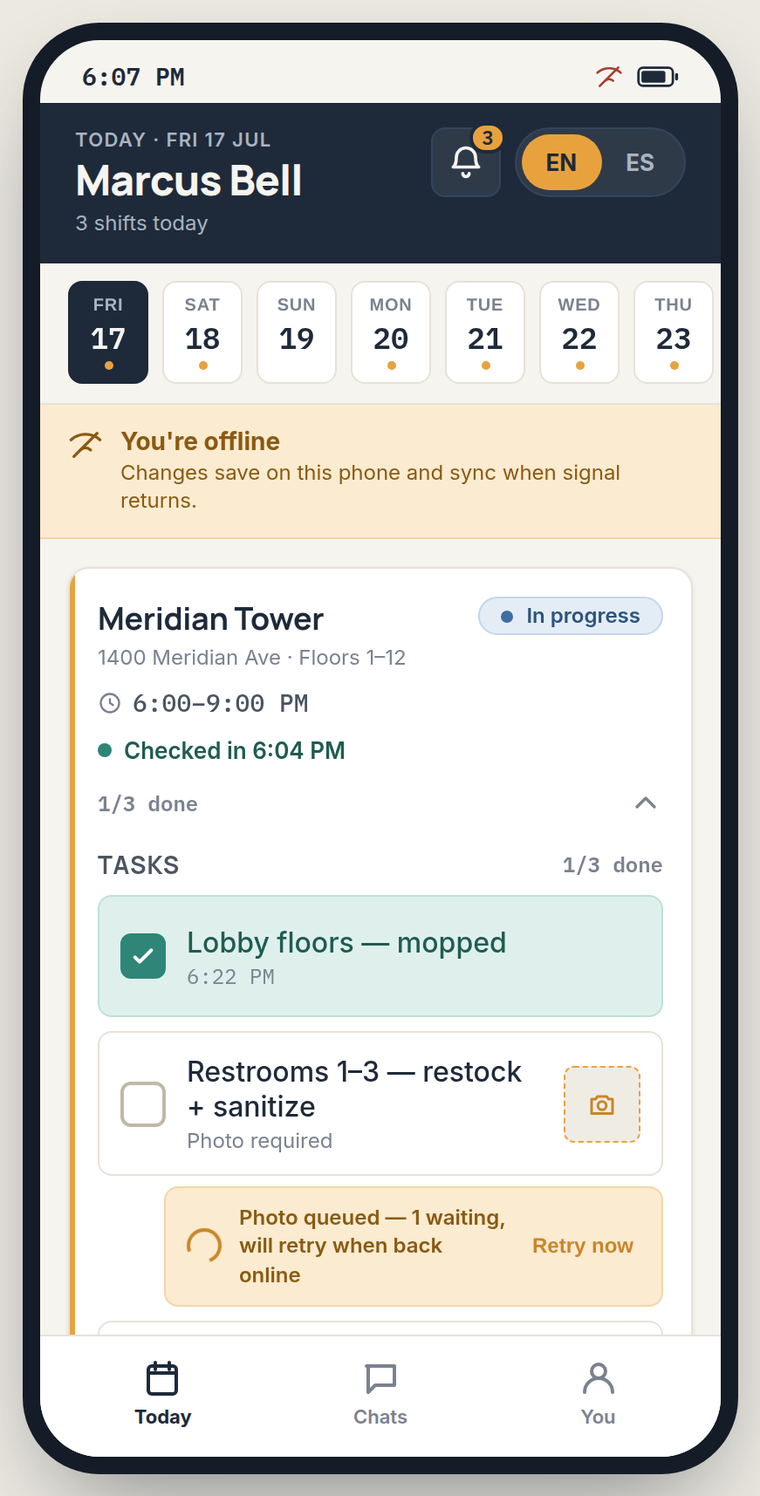
Basements and stairwells do not have signal. Going offline shows a calm amber band — "Changes save on this phone and sync when signal returns" — and the checklist keeps working. A photo that cannot upload becomes "Photo queued — 1 waiting, will retry when back online" with a manual retry. Nothing is lost and nothing is blocked.
Photo proof is a task property, not a separate step
Tasks that need evidence are marked "Photo required" with the camera affordance inline on the row. You cannot mark it done without it, and the error copy says what to do — "Add a photo before marking done" — rather than "Invalid input".
English and Spanish, switched in the header
EN/ES sits in the top bar of every screen rather than buried in settings, because the person who needs it needs it on their first launch, and may be handed the phone by someone else.
The escape hatch is on the shift card
"Can't reach site / report issue" sits directly under Check out. Locked door, wrong access code, no supplies — the most common real failure is one tap from where the cleaner already is.
Pay and leave are estimates, labelled as estimates
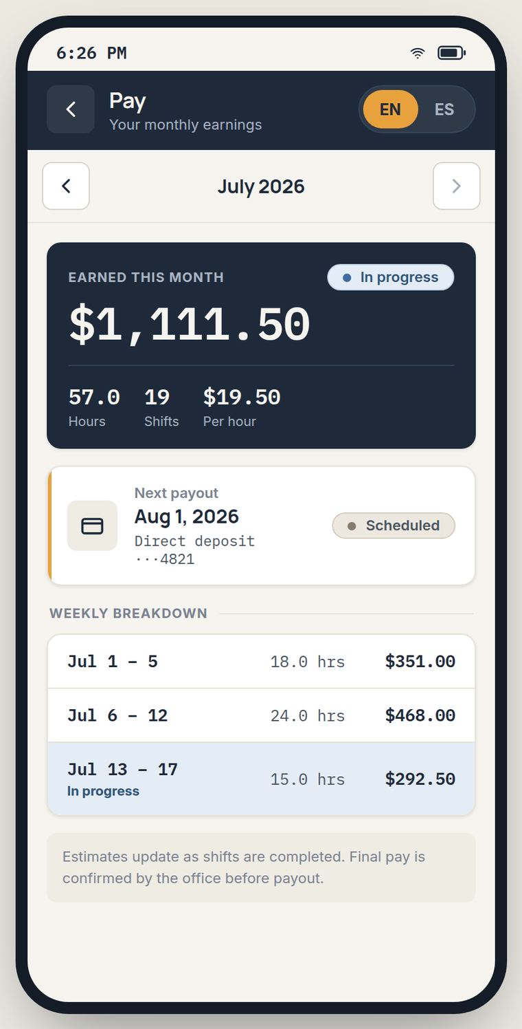
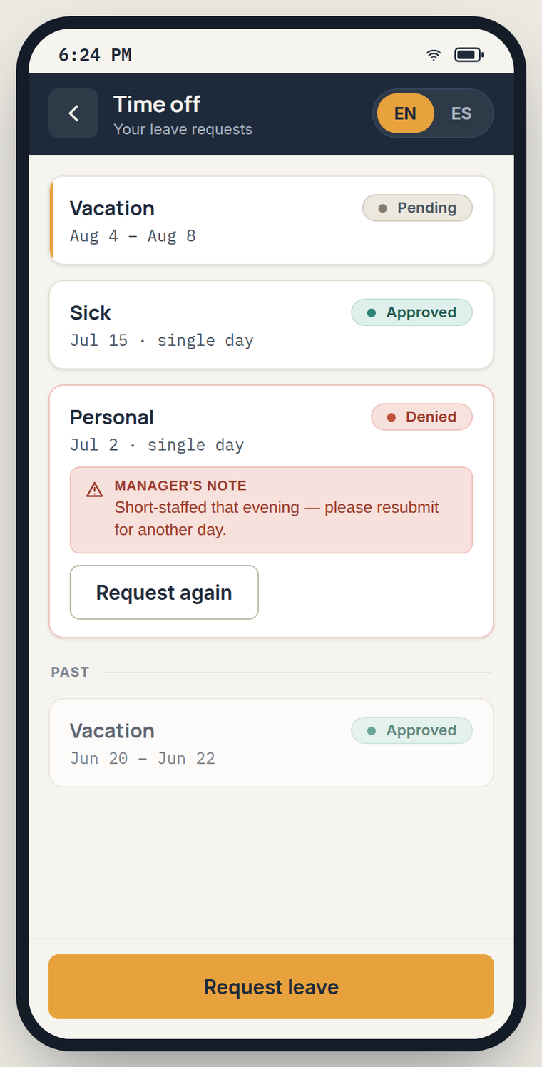
The pay screen shows earnings in progress with an explicit line: final pay is confirmed by the office before payout. A denied leave request carries the manager's reason and a "Request again" button, because a denial without a reason is how people stop using a tool.
Surface three — the client portal
07 — Property managerThe client's version of the product is not a smaller dashboard. It is a receipt. Its whole job is to let a property manager answer a question from their own boss without phoning the vendor.
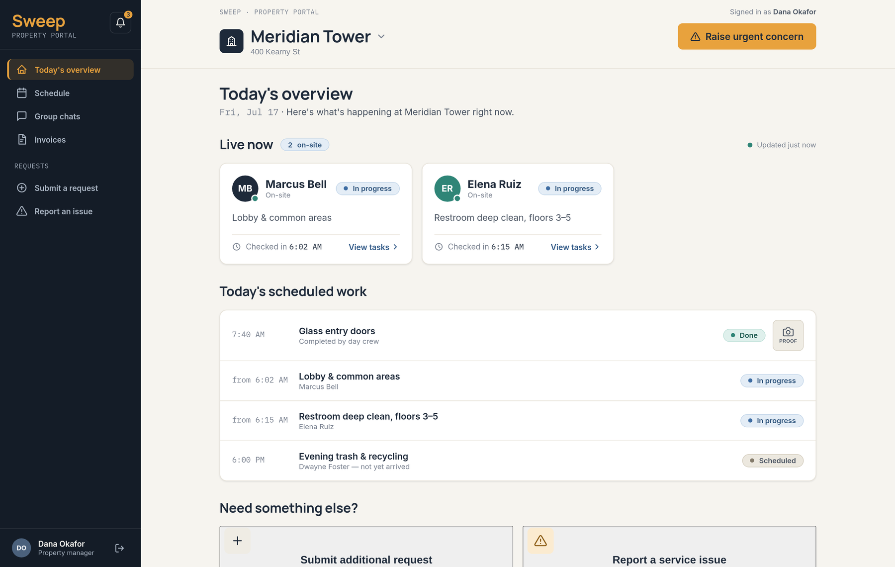
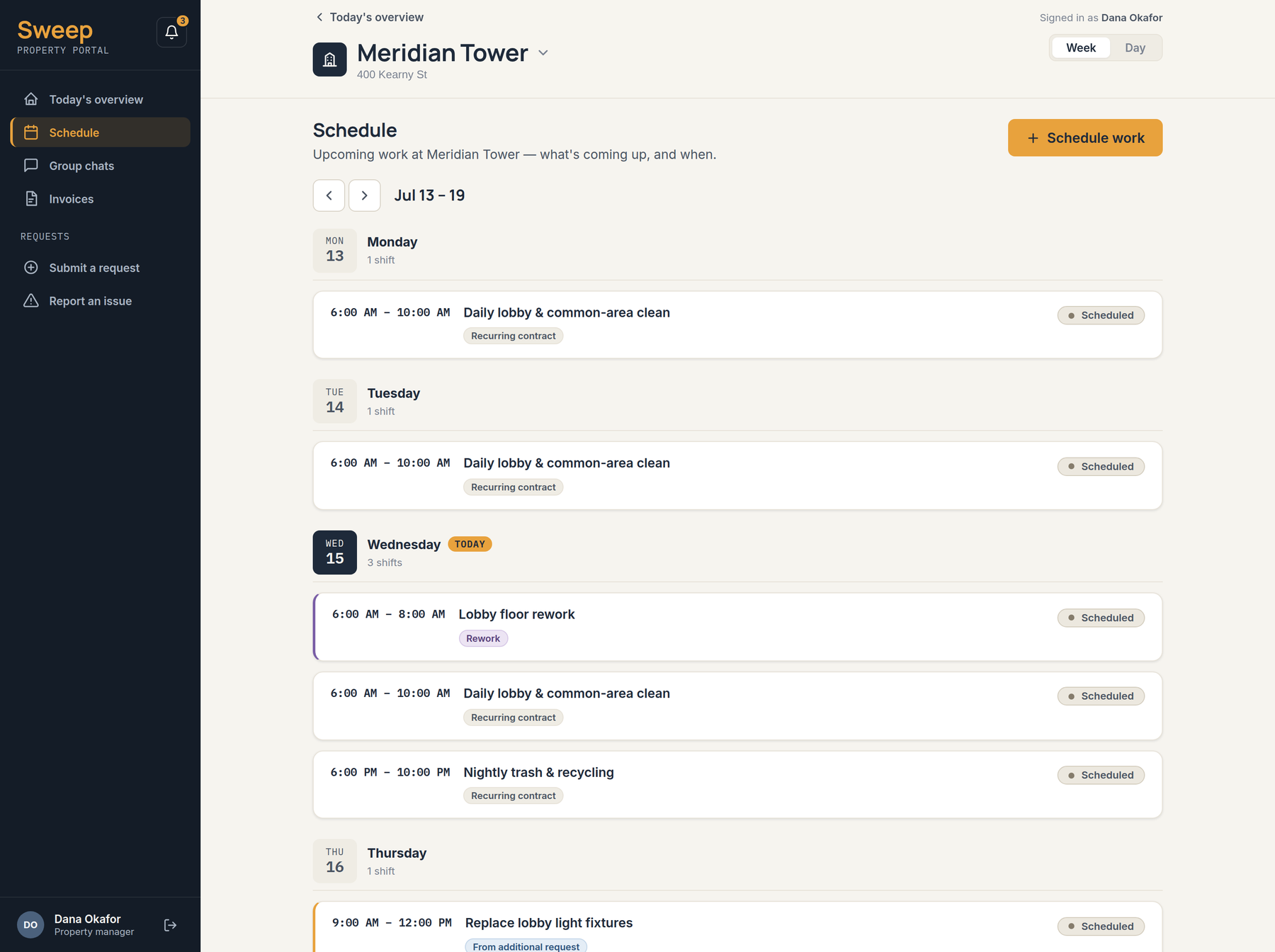
Today's overview leads with who is physically in the building right now and when they checked in, then the day's scheduled work with photo proof attached to what is already done. The schedule marks recurring contract work, rework, and work that came from an additional request as three visibly different things, so the client can always trace a job back to the reason it exists.
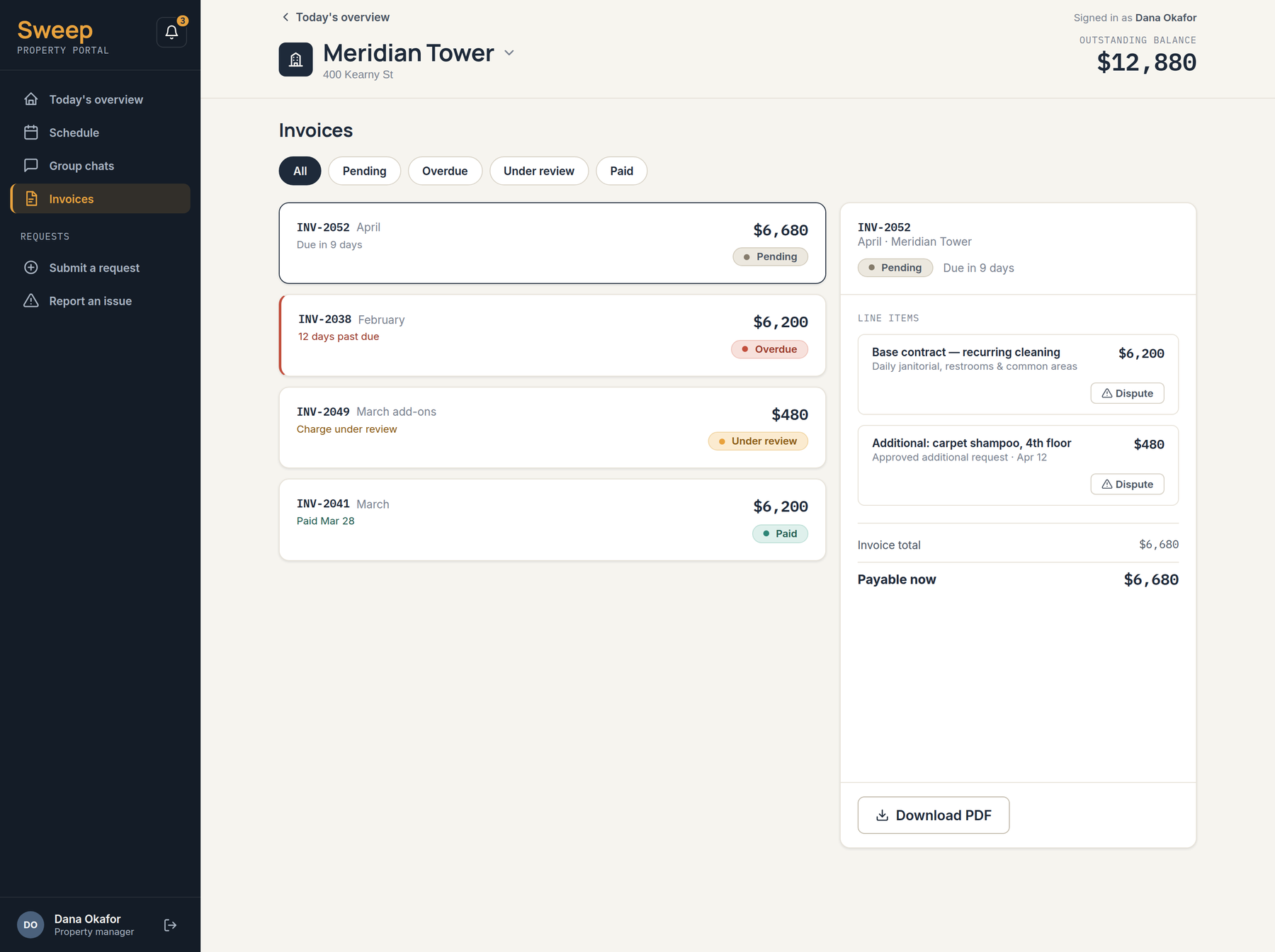
The dispute control sits on the individual line item. Disputing a whole invoice is an adversarial act that stops a payment; disputing one $480 add-on is a question. The invoice keeps a separate "Under review" state so the rest of the balance stays payable — the design lets the relationship survive the disagreement.
The escalation loop that closes the triangle
08 — Cross-surface flowThe three surfaces are only worth building as one product if something can travel between them. The clearest case is an ad-hoc specialist job — a dead outlet, a flickering light — posted by the client into a per-trade group chat where individual contractors can claim it.
The interesting part is what happens when nobody claims it. Rather than letting the request rot in a chat thread, an unclaimed request is automatically handed to the vendor after a set window, and lands in the ops manager's urgent band as an escalation with its own provenance line — "From group chat · unclaimed 3h · auto-escalated". The client sees the same handoff explained in their own thread.
Posts an ad-hoc request into the trade channel — electrical, plumbing, lawn care.
UnclaimedMembers of that channel see it and one claims it, with their name attached.
ClaimedNobody claims it inside the window. The system does not wait for a human to notice.
Unclaimed 30mAuto-escalated to the cleaning vendor and shown at the top of the ops dashboard.
EscalatedManager claims it and assigns a technician. Both sides see the same status.
Assigned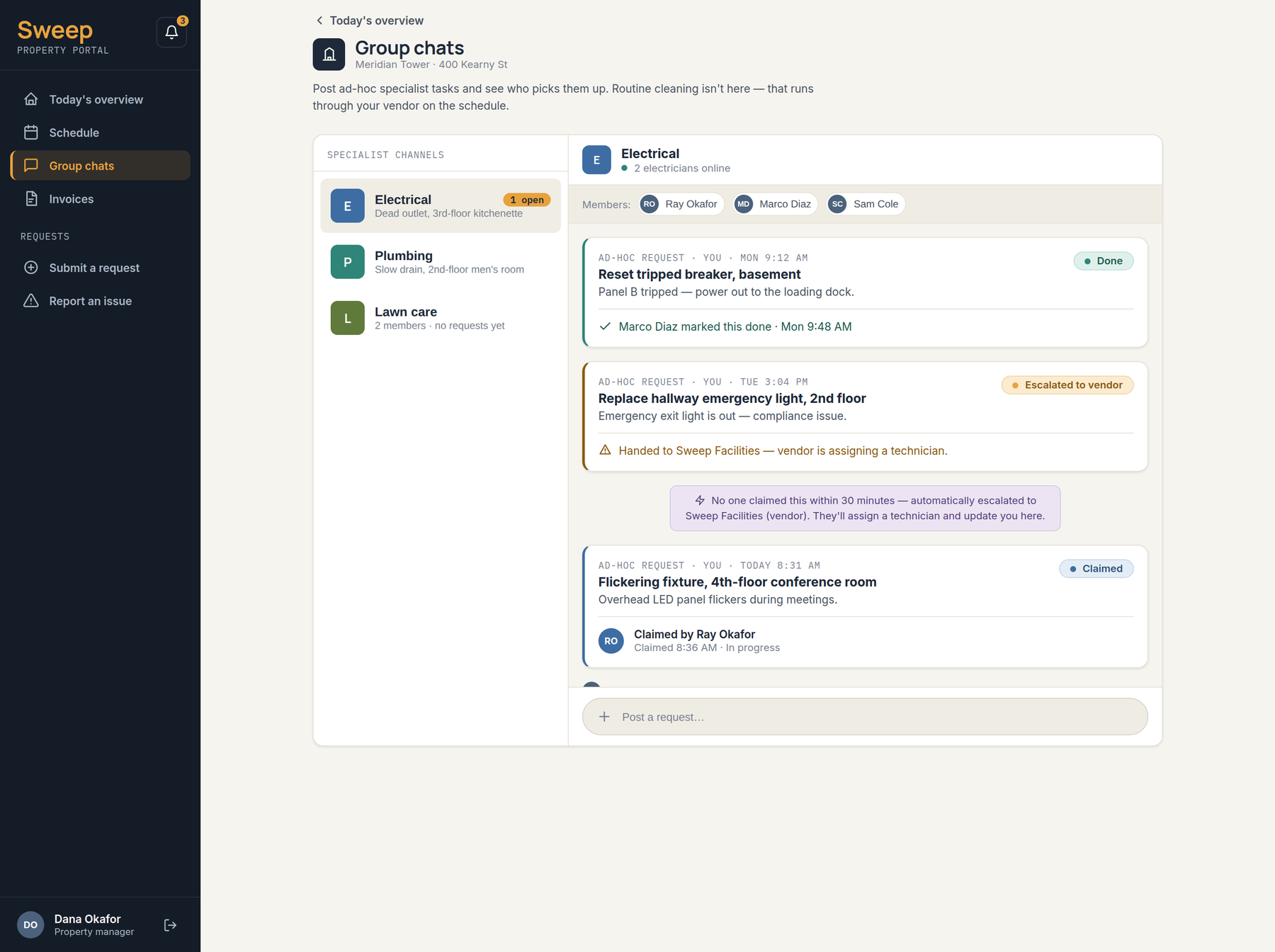
An unanswered message is a state, not an absence. Most operational software treats "nobody replied" as nothing happening. Here it is a first-class status with a timer attached to it, which is the only reason the escalation can be automatic.
Selling it in the same voice
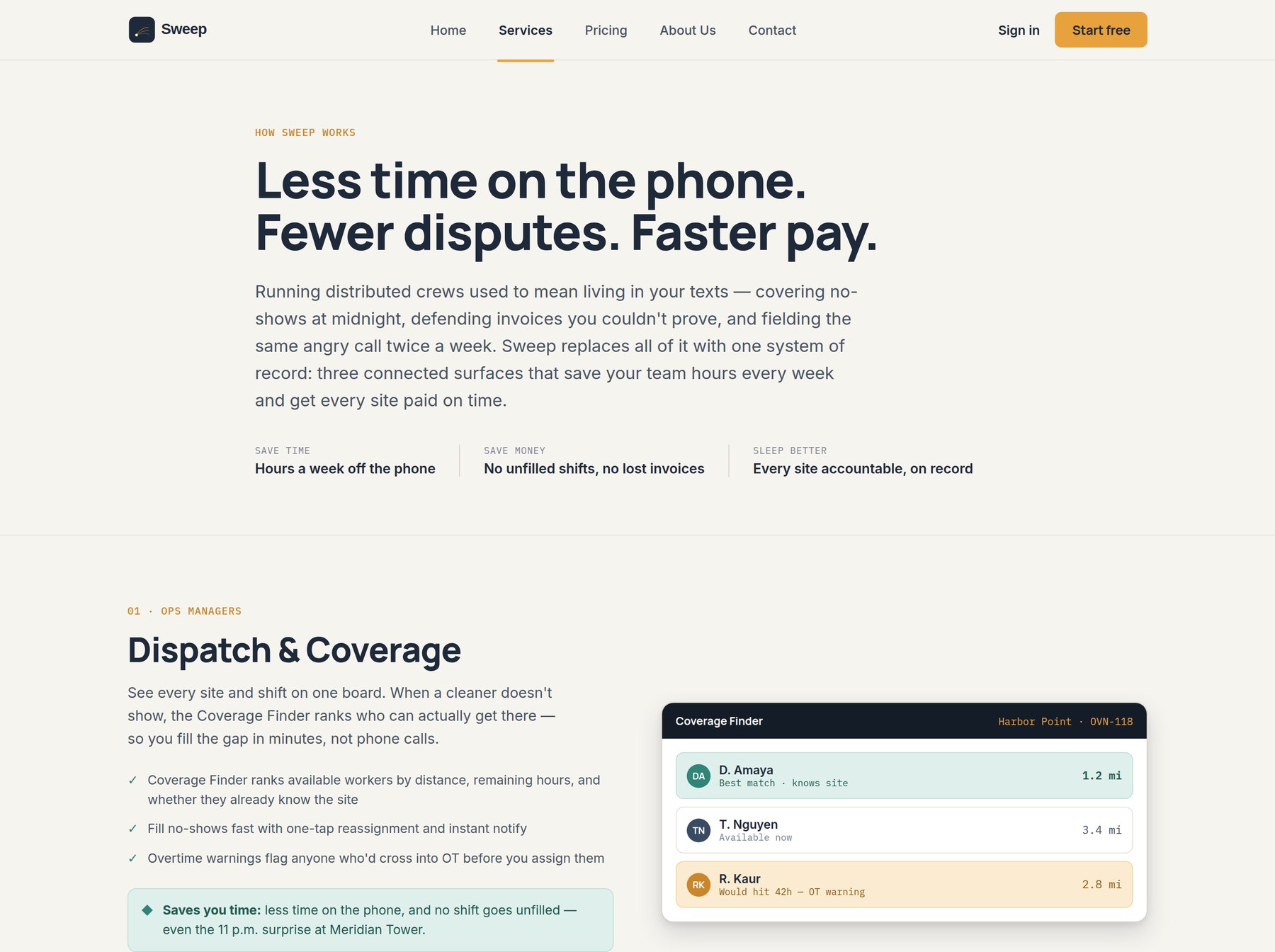
09 — Marketing siteThe last piece was a five-page marketing site built from the same tokens, which is where I found out whether the system was actually flexible or just consistent. It needed a display scale the app never uses, a two-voice split in the copy, and none of the visual crutches — no gradient hero, no stock photography, no glass panels.
The app voice is plain verbs in sentence case: "Assign", "Mark done", "Start shift". The marketing voice is allowed to be warm and declarative — "Cover every shift. See every clean." — but it still cannot use a colour the status system needs, and it still has to explain the three-doors structure honestly rather than pretending the product is one thing.
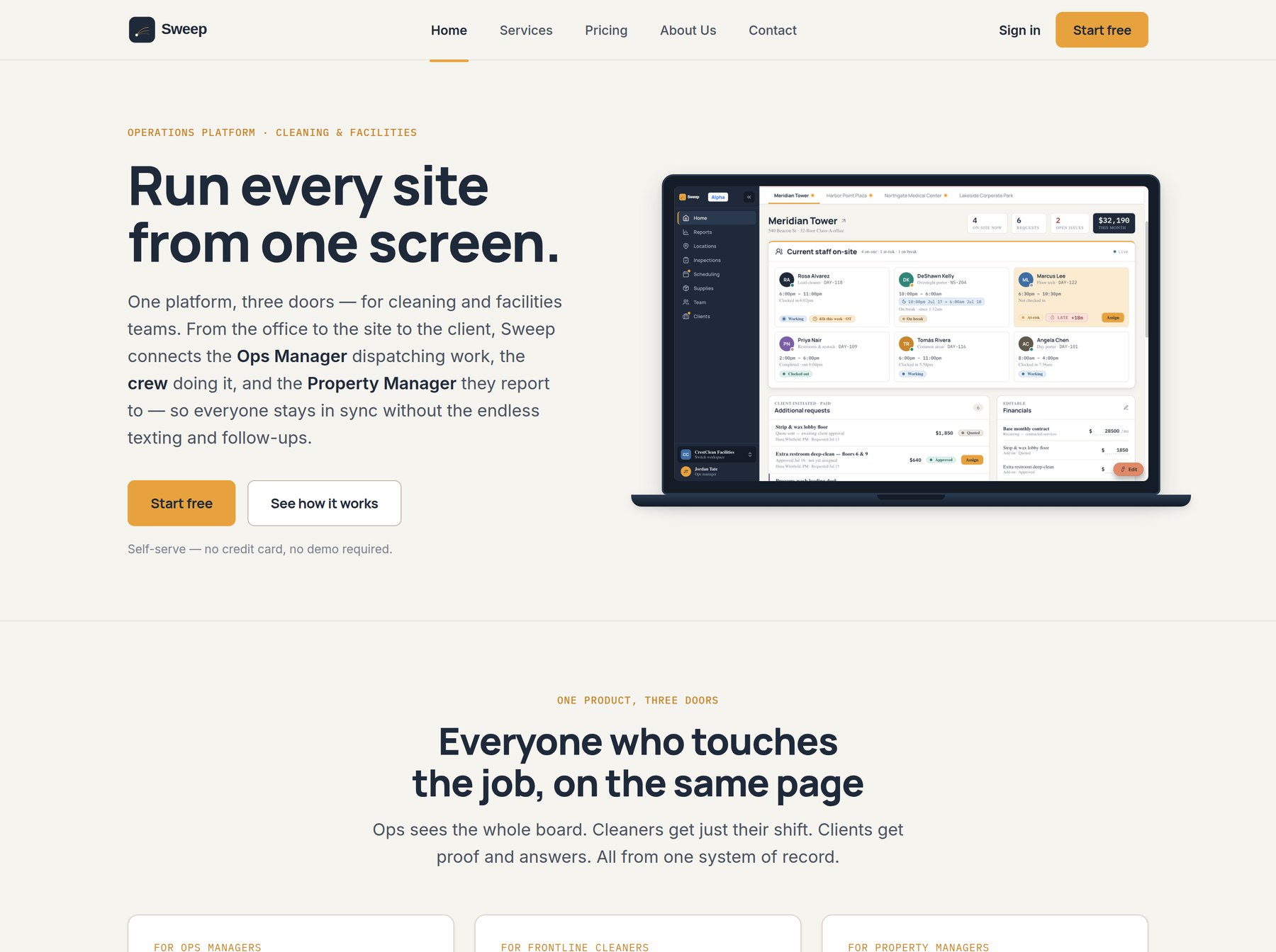
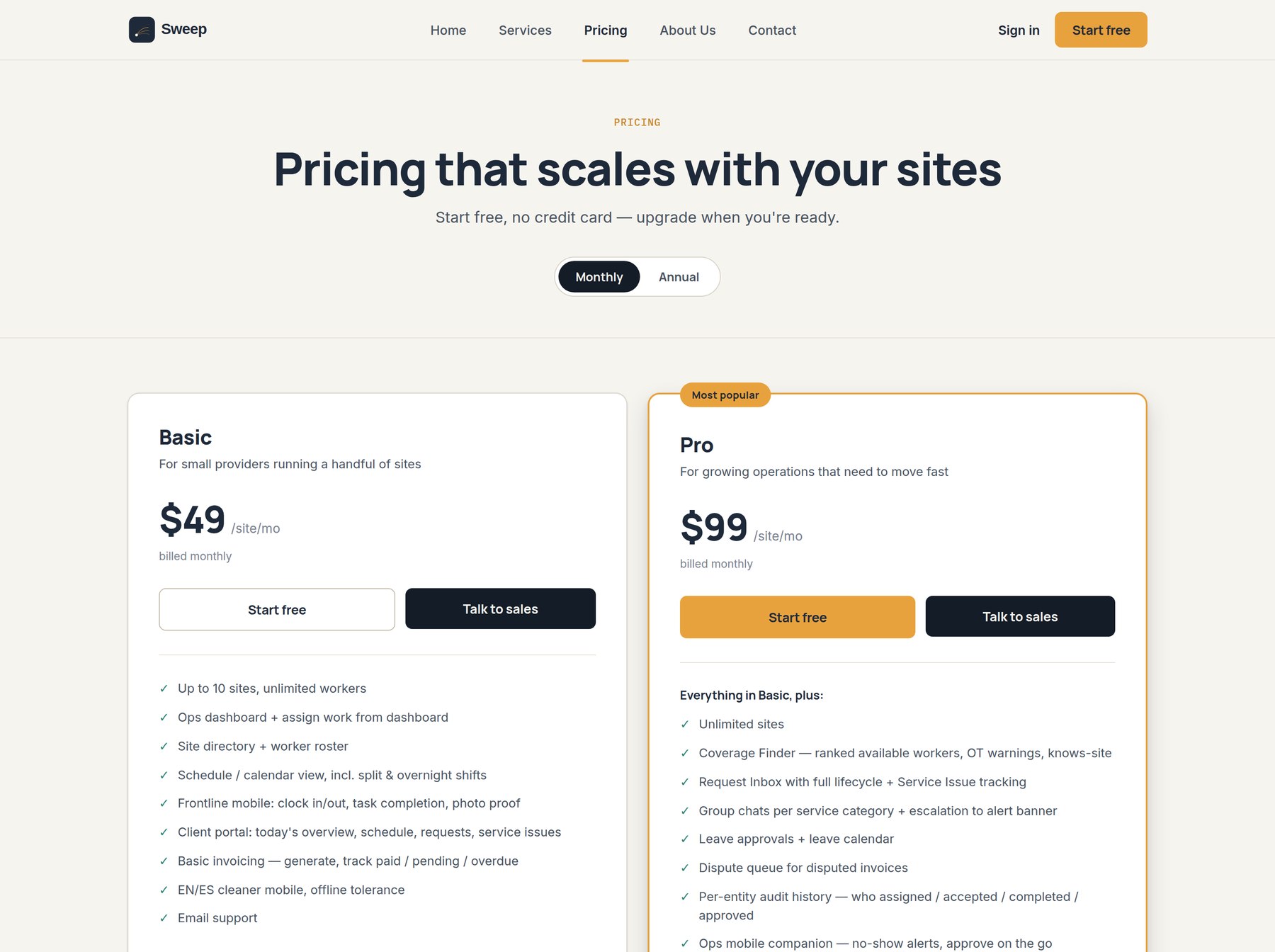
Pricing was the useful exercise. Writing a two-tier feature table forced me to decide which capabilities are the product and which are the upgrade — Coverage Finder, the escalation loop, leave approvals and the dispute queue ended up on the paid side, while photo proof, offline tolerance and the client portal stayed in the base plan. A pricing page is a product spec that has to be honest in public.
What I would put in front of users first
10 — ReflectionThis is a concept, not a shipped product, and the honest thing to say about it is which parts are decisions and which parts are assumptions.
The two-lane split between service issues and additional requests. It resolves a real money-and-trust ambiguity, and every downstream screen got simpler once it existed rather than more complicated.
The cleaner app in an actual stairwell, on an actual cheap handset, with someone who does the job. Offline behaviour, photo capture and the EN/ES switch are the three things a comfortable desk can lie to you about.
The system paid for itself at surface three
Building tokens before screens felt slow through the first surface and obviously right by the third. The client portal took a fraction of the time because almost nothing new had to be invented.
Writing the copy is designing the product
"No charge — covered by your contract" is not microcopy sitting on a feature. It is the feature. Most of the trust in this design is carried by sentences, not layout.
Constraints beat capabilities
The strongest decisions here are all subtractions — what the cleaner cannot see, what the client cannot see, the single rationed accent colour, the three tabs.